component_loads
Plot an energy system component's loads as lines and stacked bars. |
|
Plot signal and response over their respective value position. |
|
Draw step plot to compare component loads using matplotlib. |
Visualize submodule to plot individual component loads/behavior.
components is a tessif interface to visualize
energy system component loads and/or behavior.
- tessif.visualize.component_loads.bar_lines(loads, component_type, load_type='both', labels=None, timeindex=None, ticks=5, line_colors=None, bar_colors=None, drop_zero=True, **kwargs)[source]
Plot an energy system component’s loads as lines and stacked bars.
When both inflows and outflows are given, those get distinguished by the sign of their values so that they can either be plotted as bars or as lines. Outflows are always negative and inflows positive. The inflow from and the outflow to a component must be given seperately or else they will not be plotted.
The outflows of sources are plotted as bars and the inflows of sinks as lines. For other components inflows are bars and outflows are lines.
Note
bar_lines() treats +0.0 and -0.0 differently. Float zeros with a positive sign will be grouped with positive numbers and those with a negative sign with negative numbers.
- Parameters:
loads¶ (
DataFrame,ndarray,Sequence,dict) –DataFrame, matrix or dict with the energy system component’s data to be plotted. The order of the stacked bars is the same as the order in ‘loads’ with the first element in ‘loads’ being the bottom bar in the plot.
In a DataFrame each column is an inflow or outflow and each line corresponds to a timestep. The column names are used as the labels of the graphs and the index entries become the tick labels for the x-axis if no other labels or timeindex are given.
In a matrix (e.g. nested list or 2d ndarray) the lines are inflows or outflows and each column is a timestep.
In a dict each key-value pair is an inflow or outflow. The dict-keys are used as the labels of the graphs if no other labels are given. The dict-values consist of ndarrays or Sequences where each entry corresponds a timestep
component_type¶ (
str) – Contains the type of the plotted enery system component. Must be ‘bus’, ‘sink’, ‘source’, ‘storage’, ‘transformer’ or ‘connector’.load_type¶ (
str, default=’both’) – Contains the type of load from or to the plotted energy system component. Must be ‘inflows’, ‘outflows’ or ‘both’.labels¶ (
Iterable, default=None) –Iterable containing strings that become the labels for the load graphs. The order of the entries must be the same as the order of ‘loads’, going from left to right for DataFrames und dicts and from top to bottom for matrices.
The values that are given by ‘labels’ will be prefered over the values from inside the ‘loads’ DataFrame or dict. Those will be used when ‘labels’ is None.
timeindex¶ (
pandas.DatetimeIndex, default=None) – If ‘timeindex’ is given, it is used as the ticklabels for the x-axis. Else, the index of ‘loads’ is used, if ‘loads’ is a dataframe. ‘timeindex’ must have the same frequency as ‘loads’.ticks¶ (
str, default=5) – Number of ticklabels on the x-axis.line_colors¶ (
Iterable, default=None) – Iterable containing the colors for the line graphs. The colors can be in any format that matplotlib recognizes (e.g. [‘green’, ‘#0f0f0f’, (0.1, 0.2, 0.5)]). The order of the colors in ‘line_colors’ is the order of the colors of the lines as they appear in the legend, starting from the top. If no colors are given, bar_lines() tries to map the colors from tessif.frused.themes to the names of the lines.bar_colors¶ (
Iterable, default=None) – Iterable containing the colors for the bar graphs. The colors can be in any format that matplotlib recognizes (e.g. [‘green’, ‘#0f0f0f’, (0.1, 0.2, 0.5)]). The order of the colors in ‘bar_colors’ is the order of the colors of the bars as they appear in the legend, starting from the top. If no colors are given, bar_lines() tries to map the colors from tessif.frused.themes to the names of the bars.drop_zero¶ (bool, default=True) – If
True, do not include columns holding only zeros. Otherwise they are added to the list of bars.**kwargs¶ – Options to pass to matplotlib plotting method.
- Returns:
Matplotlib axes object holding the plotted figure elements.
- Return type:
matplotlib.axes
Examples
>>> from tessif.visualize import component_loads
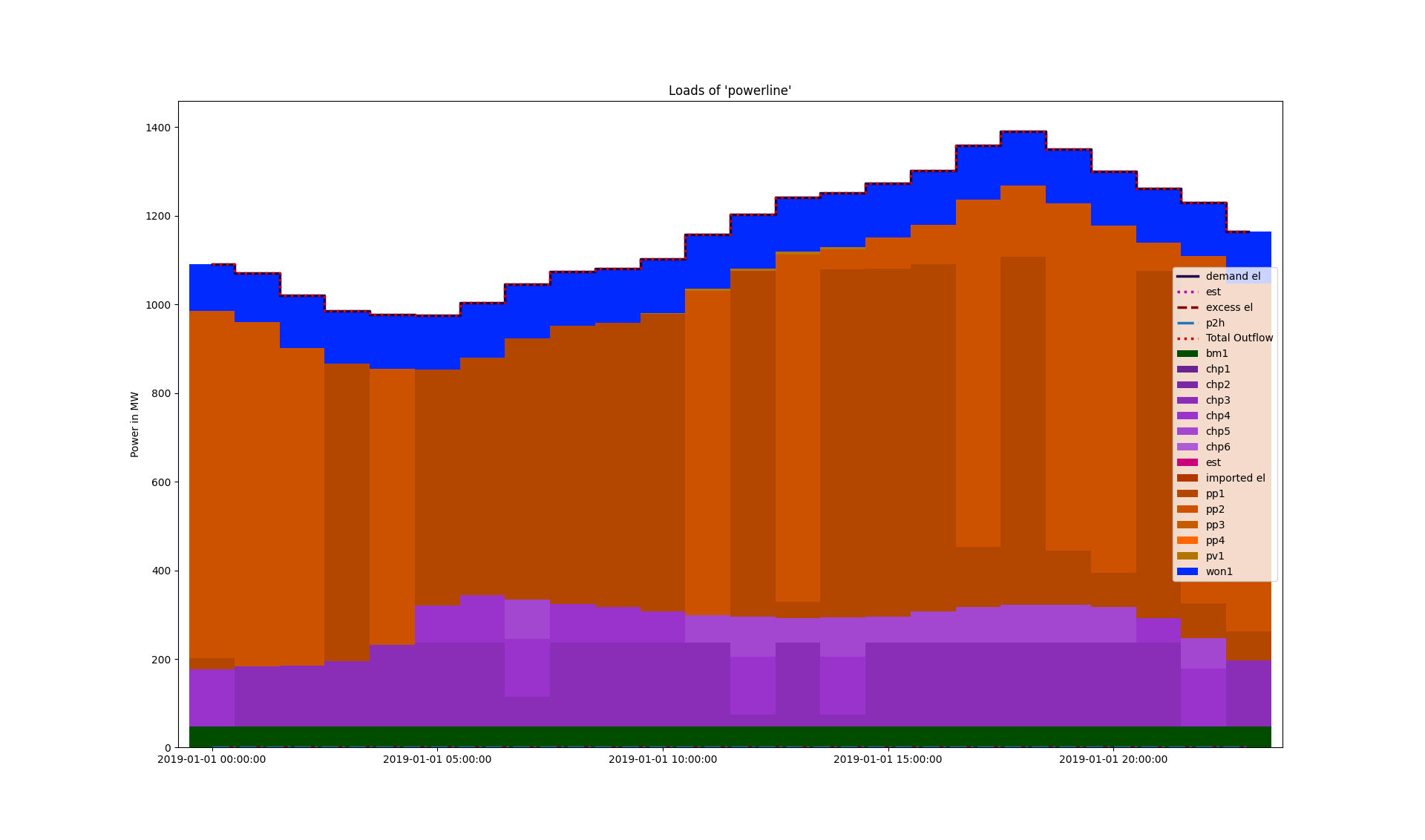
Visualize the loads of a comonent of the ‘Hamburg Energy System’ example created with tessif:
1. Use the example hub’s
create_hhes()utility to create the energy system:>>> from tessif.examples.data.tsf.py_hard import create_hhes >>> tessif_es = create_hhes()
2. Transform the
tessif energy system:>>> import tessif.transform.es2es.omf as tessif_to_oemof >>> oemof_es = tessif_to_oemof.transform(tessif_es)
Simulate the oemof energy system:
>>> import tessif.simulate as simulate
>>> optimized_oemof_es = simulate.omf_from_es(oemof_es, solver='cbc')
Extract the load results from one of the components:
>>> import tessif.transform.es2mapping.omf as oemof_results
>>> resultier = oemof_results.LoadResultier(optimized_oemof_es)
>>> loads = resultier.node_load['powerline']
Visualize the loads:
>>> axes = component_loads.bar_lines(loads, component_type='bus')
>>> # axes.figure.show() commented out for doctesting
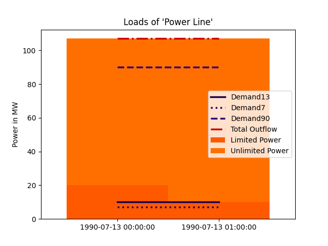
Visualize the loads of a component of the ‘star’ example energy system created with oemof:
1. Use the example hub’s
create_star()utility to create the energy system and extract the load results from one of the components:>>> import tessif.examples.data.omf.py_hard as omf_examples >>> import tessif.transform.es2mapping.omf as oemof_results >>> resultier = oemof_results.LoadResultier(omf_examples.create_star()) >>> loads = resultier.node_load['Power Line']
Visualize the loads:
>>> axes = component_loads.bar_lines(loads, component_type='bus')
>>> # axes.figure.show() commented out for doctesting
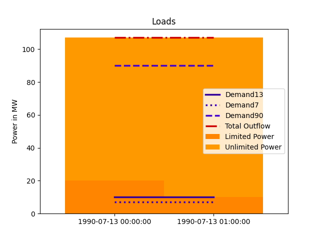
Visualize loads given as matrix:
Create the matrix and the other parameters:
>>> import pandas as pd
>>> loads = [[-20.0, -10.0],
...          [-87.0, -97.0],
...          [10.0, 10.0],
...          [7.0, 7.0],
...          [90.0, 90.0]]
>>> labels = ['Limited Power', 'Unlimited Power', 'Demand13', 'Demand7',
...           'Demand90']
>>> timeindex = pd.date_range('7/13/1990', periods=2, freq='H')
Visualize the loads:
>>> figure = component_loads.bar_lines(
...     loads, component_type='bus', labels=labels, timeindex=timeindex)
>>> # figure.show() commented out for doctesting
- tessif.visualize.component_loads.response(signals, responses=[], transfers=[], sigplot=<function step>, replot=<function plot>, shape=(), title='', titles=[], legend=False, integer_ticks=True, **kwargs)[source]
Plot signal and response over their respective value position.
Designed to quickly draw input and response signals of basically any kind of transfer function not only those representing energy system components. Constructstwo pandas.DataFrames internally for data handling.
Plots
signalsusingsigplotandresponsesusingreplotinto the same diagram (one for each pairing). Usetransfersto compute responses if none are stated.- Parameters:
signals¶ (
Iterable,pandas.DataFrame) –2 depth iterable of the the input signals to be drawn as in
signals = [(s0, ..., sN), ..., (s0, ..., sN)]
Or as in:
signals = pandas.DataFrame(
    zip((s0, ..., sN), ..., (s0, ..., sN)),
    columns=['Signal1', ..., 'SignalN'])
If only 1 signal is to be plotted, outer iterable can be omitted.
responses¶ (
Iterable,pandas.DataFrame) –2 depth iterable of the output responses to be drawn as in
responses = [(r0, ..., rN), ..., (r0, ..., rN)]
Or as in:
responses = pandas.DataFrame(
    zip((s0, ..., sN), ..., (s0, ..., sN)),
    columns=['Response1', ..., 'ResponseN'])
Must be of equal length or longer than
response.signals. If only 1 signal is to be plotted, outer iterable can be omitted. Default=[]Make use of the SciPy signal library for an easy to use yet powerfull signal visualizing tool.
transfers¶ (
Iterable,pandas.DataFrame) –2 depth iterable of functionals to compute the responses in case none are provided (i.e if
response.responsesevaluates toNone).Must be of equal length or longer than
response.signals. If only 1 signal is to be plotted, outer iterable can be omitted. default=[]sigplot¶ (
Iterable, default=matplotlib.pyplot.plot) – Iterable of functionals to plot the signals. Usefunctools.partial()for supplying parameters. See also the Examples section.replot¶ (
Iterable, default=matplotlib.pyplot.bar) – Iterable of functionals to plot the responses. Usefunctools.partial()for supplying parameters. See also the Examples section.shape¶ (tuple, default=()) – Tuple of subplot dimenstions. Use this to arrange the subplots beeing drawn.
shape[0]/[1]will be interpreted as number of rows/columns respectively. If default orNone, there will be 1 subplot per row (i.e (:,1))titles¶ (
Iterable, default=[]) – Iterable of strings titeling the subplots. If not empty a title is drawn. Must be of equal length or longer thansignalslegend¶ (bool, default=False) – Legend switch. If
Truea legend is attempted to be drawn. Usefunctools.partial()for supplying labels. See also the Examples section.integer_ticks¶ (bool, default=True) – Axes tick switch. If
Truethere will only be integer ticks on both axis.kwargs¶ –
Kwargs are passed to matplotlib.pyplot.subplots
Use them for sharing x and y axes for example.
- Returns:
plt_handles – 2-tuple of handle containers of the plots drawn as in
(signal_handles, response_handles)- Return type:
2-tuple of handles
Examples
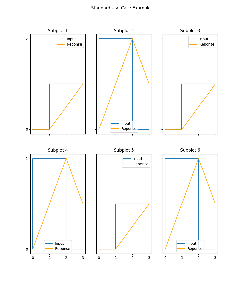
Standard Use Case Using:
functools.partial()to tweak plottingshapeto arrange the subplotskwargsto handle shared axes
>>> import functools
>>> import matplotlib.pyplot as plt
>>> signals = [(0, 0, 1, 1), (0, 2, 2, 0), (0, 0, 1, 1),
...            (0, 2, 2, 0), (0, 0, 1, 1), (0, 2, 2, 0)]
>>> responses = [(0, 0, 0.5, 1), (0, 1, 2, 1), (0, 0, 0.5, 1),
...              (0, 1, 2, 1), (0, 0, 0.5, 1), (0, 1, 2, 1)]
>>> sigs, responses = response(
...     signals, responses,
...     sigplot=functools.partial(plt.step, label='Input'),
...     replot=functools.partial(
...         plt.plot, c='orange', label='Reponse'),
...     legend=True, shape=(2, 3),
...     title='Standard Use Case Example',
...     titles=list('Subplot ' + str(i) for i in range(1, 7)),
...     sharex='col', sharey='row')
>>> fig = plt.gcf()
>>> # fig.show()
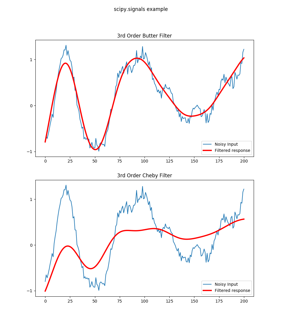
Scipy Example Using:
SciPy signal library to compute filtered responses
using the default
shapefor plottingusing
titlesto inform the viewer about the filters used
>>> import scipy.signal as signal
>>> import numpy as np
>>> import matplotlib.pyplot as plt
>>> t = np.linspace(-1, 1, 201)
>>> x = (np.sin(2*np.pi*0.75*t*(1-t) + 2.1) +
...      0.1*np.sin(2*np.pi*1.25*t + 1) +
...      0.18*np.cos(2*np.pi*3.85*t))
>>> xn = x + np.random.randn(len(t)) * 0.08
>>> sigs, responses = response(signals=[xn, xn],
...       responses=[
...           signal.filtfilt(*signal.butter(3, 0.05), xn),
...           signal.filtfilt(*signal.cheby1(3, 6, 0.05), xn)],
...       sigplot=functools.partial(plt.plot, label='Noisy Input'),
...       replot=functools.partial(
...           plt.plot, c='r', lw=3, label='Filtered response'),
...       legend=True, title='scipy.signals example',
...       titles=['3rd Order Butter Filter', '3rd Order Cheby Filter'])
>>> fig = plt.gcf()
>>> # fig.show()
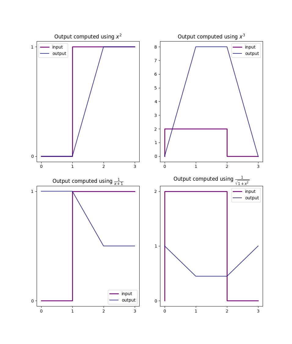
Custom Functionals Example Using:
lambda style functionals
latex syntax when labeling
>>> import math
>>> transfers = [lambda x: x**2, lambda x: x**3,
...              lambda x: 1/(x+1), lambda x: 1/math.sqrt(1+x**2)]
>>> sigs, responses = response(
...     signals[:4], transfers=transfers, shape=(2, 2),
...     replot=functools.partial(
...         plt.plot, alpha=0.8, c='navy', label='output'),
...     sigplot=functools.partial(
...         plt.step, lw=2, c='purple', label='input'),
...     titles=list('Output computed using ' + func for func in
...         ['$x^2$', '$x^3$', r'$\frac{1}{x+1}$',
...          r'$\frac{1}{\sqrt{1+x^2}}$']),
...     legend=True)
>>> fig = plt.gcf()
>>> # fig.show()
- tessif.visualize.component_loads.step(data, x_axis_data=None, labels=[], colors=[], title=None, x_axis_label=None, y_axis_label=None, where='post')[source]
Draw step plot to compare component loads using matplotlib.
- Parameters:
data¶ (Container, pandas.DataFrame) –
2 levels deep container holding the of the data to be drawn. As in:
data = [[y1(x1), ... y1(xN)],
        ...
        [yN(x1), ... yN(xN)]]
where \(y_n(x)\) describes the n-th model’s load series.
Or a
pandas.DataFramewhere each column describes a singular timeseries and the index the coresponding x-axis values (usually the point of time during the optimization the respective load data occured). The column entries will be used as legend entry labels.Warning
If providing data NOT as a
pandas.DataFramex-axis_dataandlabelshave to be provided.x-axis_data¶ (Iterable, None, default=None) –
Iterable representing the x-axis data as in:
x = (1, 2, 3, 4, 5, 6, 7, 8, 9, 10, 11, 12, 13)
x = range(13)
x = pandas.date_range(pd.datetime.now().date(),
                      periods=13, freq='H')
Note
This parameter is only needed when
datais NOT supplied as apandas.DataFrame. It is ignored otherwise.labels¶ (Iterable, default=[]) –
Iterable of strings labeling the data sets in
component_loads.data.If not empty a legend entry will be drawn for each item.
Must be of equal length or longer than
data.Note
This parameter is only needed when
datais NOT supplied as apandas.DataFrame. It is ignored otherwise.colors¶ (Iterable, default=[]) –
Iterable of color specification string coloring the data sets in
data.If not empty each plot will be colord accordingly. Otherwise matplotlibs default color rotation will be used.
List of colors stated must be greater equal the stacks to be plotted.
title¶ (str, default=None) – Title to be shown above the plot. If
Noneno title will be drawn.x-axis_label¶ (str, None, default=None) –
String labeling the x axis.
Use
Noneto not plot the x-axis label. (Note that the x-axis-labels are independent of the x-ticks lables)y_axis_label¶ (str, None, default=None) –
String labeling the y axis.
Use
Noneto not plot the y-axis label. (Note that the y-axis-labels are independent of the y-ticks lables)where¶ (str, default = 'post') –
# https://matplotlib.org/3.1.1/api/_as_gen/matplotlib.pyplot.step.html
Define where the steps should be placed:
- ’pre’: The y value is continued constantly to the left from every x
position, i.e. the interval (x[i-1], x[i]] has the value y[i].
’post’: The y value is continued constantly to the right from every x position, i.e. the interval [x[i], x[i+1]) has the value y[i].
’mid’: Steps occur half-way between the x positions.
- Returns:
Matplotlib axes object holding the plotted figure elements.
- Return type:
matplotlib.axes