compare
Pareto
Visualize the optimal results of 2 dependend variables. |
|
Visualize the optimal results of 3 dependend variables. |
|
Optimal results of 1 variable dependend of 2 other. |
Scenario/Models
Compare different bar plotted data sets containing the same kind of data. |
|
Simple bar plotting utility. |
|
Visualize a variable dependend on two others as a field of (stacked) bars. |
compare is a tessif interface allowing
visual comparision between data of the same type but coming different sources.
- tessif.visualize.compare.pareto2D(data, labels=[], colors=[], xy_labels=('x', 'y'), title=None, **kwargs)[source]
Visualize the optimal results of 2 dependend variables.
Uses a 2-depth nested sequence or a (2 column MultiIndex)
pandas.DataFrameas data input.Plotting is done using
matplotlib.pyplot.plot().- Parameters:
data¶ (
Sequence,pandas.DataFrame) –3 depth sequence of the data to be drawn. As in:
data = [([x1, ..., xN], [y1, ..., yN]), ...]
Or a 2 column MultiIndex DataFrame as in:
data = pandas.DataFrame(
        zip([x1, ..., xN], [y1, ..., yN], ...),
        colums=pd.MultiIndex.from_tuples(
            itertools.product(['Case 1', 'Case 2'], ['x', 'y']))
        )
labels¶ (
Sequence, default=[]) –Sequence of strings labeling the data sets in
pareto2D.data.If not empty a legend entry will be drawn for each item.
Must be of equal length or longer than
datacolors¶ (
Sequence, default=[]) –data. Sequence of color specification string coloring the data sets inIf not empty each plot will be colord accordingly. Otherwise matplotlibs default color rotation will be used.
Must be of equal length or longer than
dataxy_labels¶ (tuple, None, default=('x', 'y')) –
2 tuple of axis labeling strings.
First entry is interpreted as x label, second as y label. All others will be ignored.
Use
Noneto not plot any axis labelstitle¶ (str, default=None) – Title to be shown above the plot. If
Noneno title will be drawn.kwargs¶ – kwargs are passed to
matplotlib.pyplot.plot().
- Returns:
pareto2D_draw – List of
matplotlib.lines.Line2Dobjects of the drawn data.- Return type:
Example
Most simple use case for drawing a pareto front (pf)
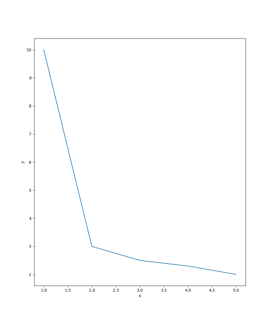
>>> from tessif.visualize import compare
>>> data=[[1, 2, 3, 4, 5], [10, 3, 2.5, 2.3, 2]]
>>> pf=compare.pareto2D(data)
3 Pareto Fronts (pfs) in 1 plot:
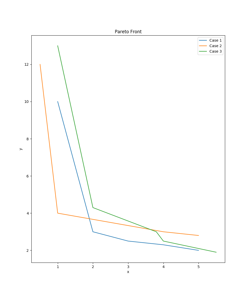
>>> data=[([1, 2, 3, 4, 5], [10, 3, 2.5, 2.3, 2]),
... ([0.5, 1, 4, 4.5, 5], [12, 4, 3, 2.9, 2.8]),
... ([1, 2, 3.8, 4, 5.5], [13, 4.3, 3, 2.5, 1.9])]
>>> labels=['Case 1', 'Case 2', 'Case 3']
>>> pfs=compare.pareto2D(data, labels=labels, title='Pareto Front')
1 Pareto Front (pf) using a pandas.DataFrame and using matplotlib’s kwargs:
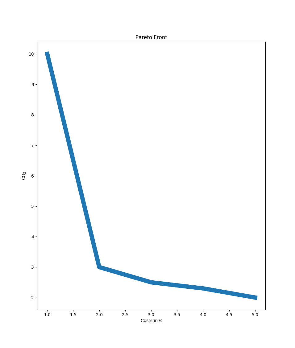
>>> import pandas as pd
>>> data = pd.DataFrame(
... zip([1, 2, 3, 4, 5], [10, 3, 2.5, 2.3, 2]),
... columns=['Costs in €', 'CO$_2$'])
>>> pf=compare.pareto2D(data, title='Pareto Front',
... xy_labels=tuple(data.columns), lw=10)
2 Pareto Fronts (pfs) using a MultiIndex pandas.DataFrame:
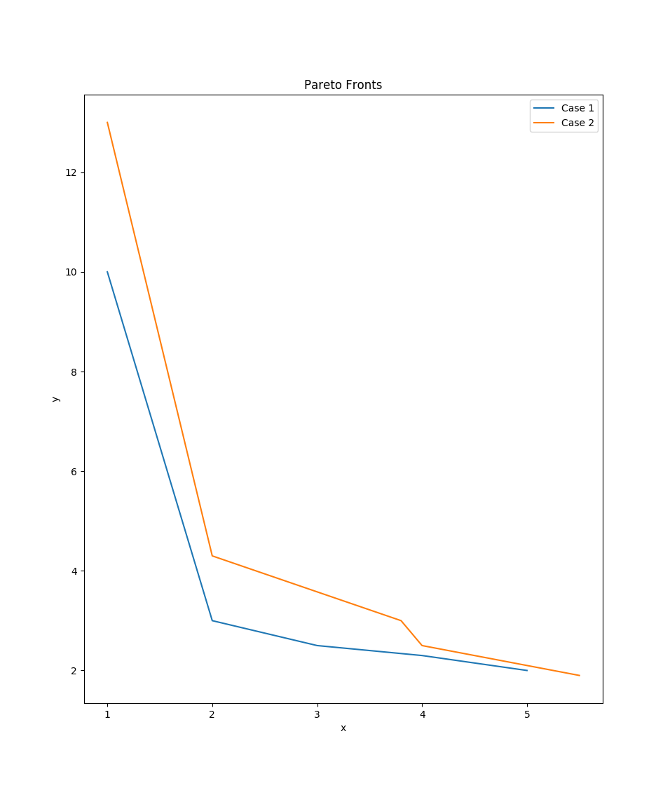
>>> import itertools
>>> data = pd.DataFrame(zip(
... [1, 2, 3, 4, 5], [10, 3, 2.5, 2.3, 2],
... [1, 2, 3.8, 4, 5.5], [13, 4.3, 3, 2.5, 1.9]),
... columns=pd.MultiIndex.from_tuples(
... itertools.product(['Case 1', 'Case 2'], ['x', 'y'])))
>>> pfs=compare.pareto2D(data, title='Pareto Fronts',
... labels = list(data.columns.levels[0]),
... xy_labels=tuple(data.columns.levels[1]))
- tessif.visualize.compare.interpolate_pareto3D(data, interpolation_type='linear', labels=[], cmaps=[], xyz_labels=('x', 'y', 'z'), title=None, wireframes=[], scatter={'c': 'r', 'marker': 'o', 's': 20}, zooming={'order': 1, 'zoom': 1}, zoom_scatter={'c': 'b', 'marker': 'o', 's': 10}, legend=True, **kwargs)[source]
Visualize the optimal results of 3 dependend variables. Comes down to drawing a 3D surface plot out of 3 1D arrays.
Uses a 3-depth nested sequence or a (3 column MultiIndex)
pandas.DataFrameas data input.Plotting is done using Axes3D.plot_surface.
- Parameters:
data¶ (
Sequence,pandas.DataFrame) –3 depth sequence of the data to be drawn. As in:
data = [([x1, ..., xN], [y1, ..., yN], [z1, ..., zN]), ...]
Or a 3 column MultiIndex DataFrame as in:
data = pandas.DataFrame(
        zip([x1, ..., xN], [y1, ..., yN], ...),
        colums=pd.MultiIndex.from_tuples(
            itertools.product(['Case 1', ..., 'Case N'],
                              ['x', 'y', 'z']))
        )
labels¶ (
Sequence, default=[]) –Sequence of strings labeling the data sets in
data.If not empty a legend entry will be drawn for each item.
Must be of equal length or longer than
datacmaps¶ (
Sequence, default=[]) –Sequence of colormap specification strings for coloring the data sets in
data.If not empty each plot will be colored accordingly. Otherwise matplotlibs default color rotation will be used.
Must be of equal length or longer than
dataxyz_labels¶ (tuple, None, default=('x', 'y', 'z')) –
3 tuple of axis labeling strings.
First, second, third label are interpreted as x, y, z-label respectively. All others will be ignored.
Use
Noneto not plot any axis labelstitle¶ (str, default=None) – Title to be shown above the plot. If
Noneno title will be drawn.scatter¶ (dict, default={'c':'r', 'marker': 'o', 's':20}) –
Draw an additional scatterplot to visualize input data.
To conifgurate the scatter plot provide respective kwargs in this dictionairy.
Pass something that evaluates to
Falseduring theis scatter:call if you don’t want scatter points to be drawn. (i.e.{}orNone)wireframes¶ (
Sequence, default=[]) –Sequence of bools. Visualize the data set as a wireframe plot instead of a surface plot if respective entry is``True``.
Must be of equal length or longer than
datazooming¶ (dict, default={zoom=1, order=1}) –
Use the scipy’s zoom utility to generate additional data points.
Highly unscientific depending on the context used. Nonetheless quite beautifull and handy in times.
zoom_scatter¶ (dict, default={'c': 'b', 'marker': 'o', 's':10}) – Creates zoomed scatter points if zooming[‘zoom’] > 1. See also
scatter.legend¶ (bool, default=True) – Draws a legend describing
scatterandzoom_scatterifTrueand one of the beforenamed scatter plots is drawn.**kwargs¶ –
kwargs are passed to Axes3D.plot_surface
- Returns:
pfs – List of Collections of 3D polygons of the drawn data.
- Return type:
Example
Most simple use case for drawing a pareto front (pf):
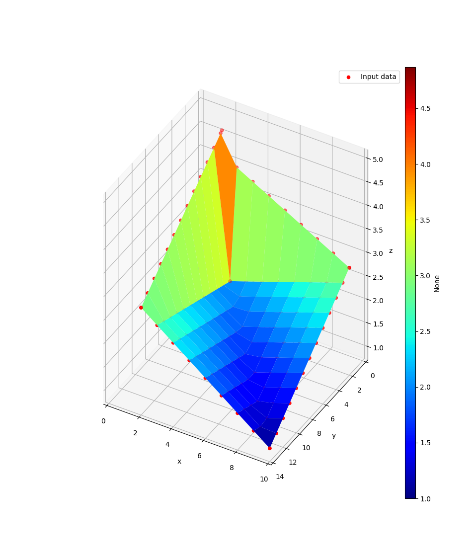
>>> from tessif.visualize import compare
>>> data=([10, 10, 2, 2, 3], [14, 2, 14, 1.8, 3], [1, 3, 3, 4.9, 2])
>>> pf=compare.interpolate_pareto3D(data)
3 Pareto Fronts (pfs) in 1 plot:
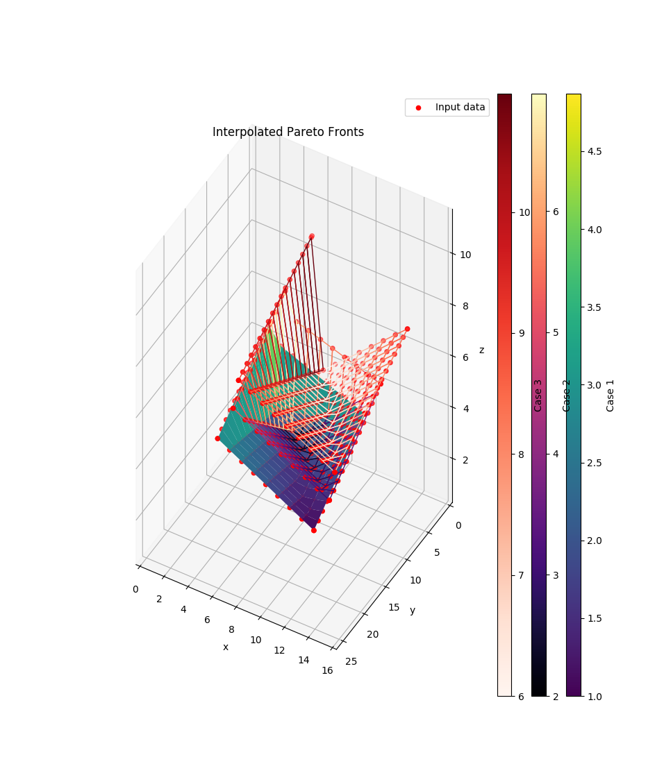
>>> data = [([10, 10, 2, 2, 3], [14, 2, 14, 1.8, 3], [1, 3, 3, 4.9, 2]),
...         ([12, 12, 4, 4, 5], [16, 4, 16, 3.8, 5], [3, 5, 5, 7, 2]),
...         ([16, 16, 8, 8, 9], [26, 9, 26, 8.8, 9], [7, 9, 9, 11, 6])]
>>> labels = ['Case 1', 'Case 2', 'Case 3']
>>> cmaps = ['viridis', 'magma', 'Reds']
>>> wireframes = [False, True, True]
>>> pfs = compare.interpolate_pareto3D(
...     data, labels=labels, cmaps=cmaps,
...     title='Interpolated Pareto Fronts', wireframes=wireframes)
1 Pareto Front (pf) using a pandas.DataFrame and using matplotlib’s kwargs while getting rid of this pesky scatter plot:
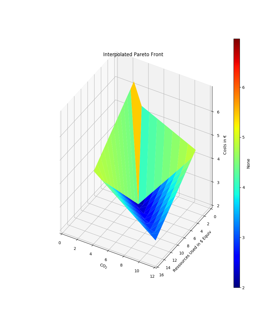
>>> import pandas as pd
>>> data = pd.DataFrame(
...     zip([12, 12, 4, 4, 5], [16, 4, 16, 3.8, 5], [3, 5, 5, 7, 2]),
...     columns=['CO$_2$', 'Ressources Used in $ Equiv', 'Costs in €'])
>>> pf = compare.interpolate_pareto3D(
...     data, title='Interpolated Pareto Front',
...     xyz_labels=tuple(data.columns), scatter=None)
2 Pareto Fronts (pfs) using a MultiIndex pandas.DataFrame and zoom in:
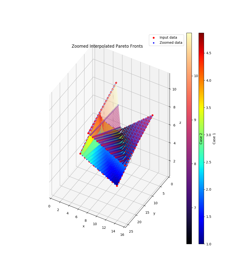
>>> import itertools
>>> data = pd.DataFrame(
...     zip([10, 10, 2, 2, 3], [14, 2, 14, 1.8, 3], [1, 3, 3, 4.9, 2],
...         [16, 16, 8, 8, 9], [26, 9, 26, 8.8, 9], [7, 9, 9, 11, 6]),
...     columns=pd.MultiIndex.from_tuples(
...         itertools.product(['Case 1', 'Case 2'], ['x', 'y', 'z'])))
>>> pfs = compare.interpolate_pareto3D(
...     data,
...     title='Zoomed Interpolated Pareto Fronts',
...     labels = list(data.columns.levels[0]),
...     cmaps = ['jet', 'magma'],
...     xyz_labels=tuple(data.columns.levels[1]),
...     zooming={'zoom': 2, 'order': 1},
...     wireframes=[False, True])
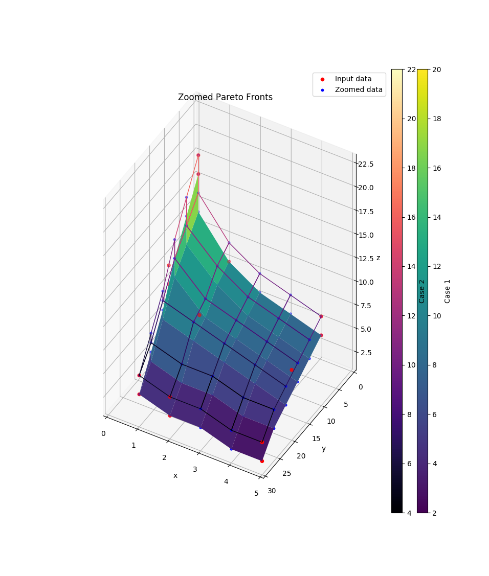
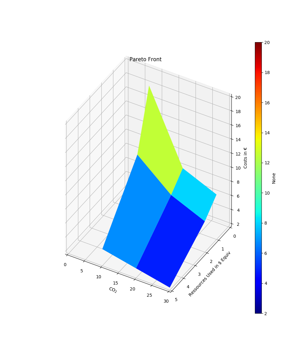
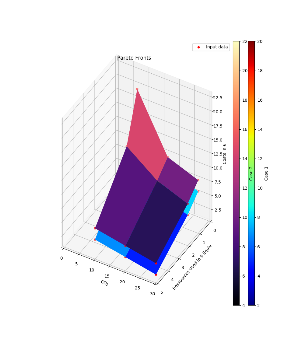
- tessif.visualize.compare.pareto3D(data, labels=[], cmaps=[], xyz_labels=('x', 'y', 'z'), title=None, wireframes=[], scatter={'c': 'r', 'marker': 'o', 's': 20}, zooming={'order': 1, 'zoom': 1}, zoom_scatter={'c': 'b', 'marker': 'o', 's': 10}, legend=True, **kwargs)[source]
Optimal results of 1 variable dependend of 2 other. Comes down to drawing a 3D plot out of 2 1D arrays and 1 2D array.
Uses a 3-depth nested sequence or a list of 3 column class:pandas.DataFrame as data input.
Plotting is done using
matplotlib.pyplot.plot().- Parameters:
3 depth sequence of the data to be drawn. As in:
data = [([x1, ..., xN], [y1, ..., yN],
        [z(x1, y1), ..., z(xN, y1)],[z(x1, yN), ..., z(xN, yN)]),
       ...]
Or an sequence of
pandas.DataFrameas in:data = [pandas.DataFrame( [z(x1, yN), ..., z(xN, yN)], colums=[i for i in x], index[i for i in y]), pandas.DataFrame( [z(x1, yN), ..., z(xN, yN)], colums=[i for i in x], index[i for i in y])]
labels¶ (
Sequence, default=[]) –Sequence of strings labeling the data sets in
data.If not empty a legend entry will be drawn for each item.
Must be of equal length or longer than
datacmaps¶ (
Sequence, default=[]) –Sequence of colormap specification strings for coloring the data sets in
data.If not empty each plot will be colored accordingly. Otherwise matplotlibs default color rotation will be used.
Must be of equal length or longer than
dataxyz_labels¶ (tuple, None, default=('x', 'y', 'z')) –
3 tuple of axis labeling strings.
First, second, third label are interpreted as x, y, z-label respectively. All others will be ignored.
Use
Noneto not plot any axis labelstitle¶ (str, default=None) – Title to be shown above the plot. If
Noneno title will be drawn.scatter¶ (dict, default={'c':'r', 'marker': 'o', 's':20}) –
Draw an additional scatterplot to visualize input data.
To conifgurate the scatter plot provide respective kwargs in this dictionairy.
Pass something that evaluates to
Falseduring theis scatter:call if you don’t want scatter points to be drawn. (i.e.{}orNone)wireframes¶ (
Sequence, default=[]) –Sequence of bools. Visualize the data set as a wireframe plot instead of a surface plot if respective entry is``True``.
Must be of equal length or longer than
datazooming¶ (dict, default={zoom=1, order=1}) –
Use the scipy’s zoom utility to generate additional data points.
Highly unscientific depending on the context used. Nonetheless quite beautifull and handy in times.
zoom_scatter¶ (dict, default={'c': 'b', 'marker': 'o', 's':10}) – Creates zoomed scatter points if zooming[‘zoom’] > 1. See also
scatter.legend¶ (bool, default=True) – Draws a legend describing
scatterandzoom_scatterifTrueand one of the beforenamed scatter plots is drawn.**kwargs¶ –
kwargs are passed to Axes3D.plot_surface
- Returns:
pfs – List of Collections of 3D polygons of the drawn data.
- Return type:
Example
Most simple use case for drawing a pareto front (pf):
>>> from tessif.visualize import compare
>>> data=([5, 2, 1], [30, 20, 10], [[2, 3, 4], [6, 8, 12], [8, 10, 20]])
>>> pf=compare.pareto3D(data)
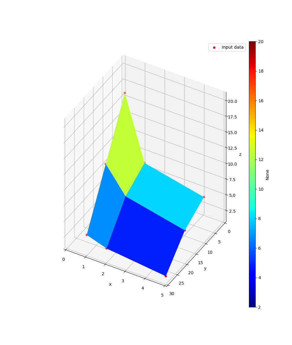
2 Pareto Fronts (pfs) in 1 plot:
>>> data=[([5, 2, 1], [30, 20, 10], [[2, 3, 4], [6, 8, 12], [8, 10, 20]]),
... ([5, 2, 1], [30, 20, 10], [[4, 5, 6], [8, 10, 14], [10, 12, 22]])]
>>> labels=['Case 1', 'Case 2']
>>> cmaps=['viridis', 'magma']
>>> wireframes=[False, True]
>>> pfs=compare.pareto3D(
... data, labels=labels, cmaps=cmaps, title='Zoomed Pareto Fronts',
... wireframes=wireframes, zooming={'zoom': 2, 'order': 1})
1 Pareto Front (pf) using a pandas.DataFrame and using matplotlib’s kwargs while getting rid of this pesky scatter plot:
>>> import pandas as pd
>>> x = [30, 20, 10]
>>> y = [5, 2, 1]
>>> data = pd.DataFrame(
... [[2, 3, 4], [6, 8, 12], [8, 10, 20]],
... index=[i for i in y],
... columns=[i for i in x])
>>> xyz_labels=['CO$_2$', 'Ressources Used in $ Equiv', 'Costs in €']
>>> pf=compare.pareto3D(data, title='Pareto Front',
... xyz_labels=xyz_labels, scatter=None)
2 Pareto Fronts (pfs) using a list of pandas.DataFrames:
>>> x = [30, 20, 10]
>>> y = [5, 2, 1]
>>> xyz_labels=['CO$_2$', 'Ressources Used in $ Equiv', 'Costs in €']
>>> data = [pd.DataFrame(
... [[2, 3, 4], [6, 8, 12], [8, 10, 20]],
... index=[i for i in y],
... columns=[i for i in x]),
... pd.DataFrame(
... [[4, 5, 6], [8, 10, 14], [10, 12, 22]],
... index=[i for i in y],
... columns=[i for i in x])]
>>> pfs=compare.pareto3D(data, title='Pareto Fronts',
... labels = ['Case 1', 'Case 2'],
... cmaps = ['jet', 'magma'],
... xyz_labels=xyz_labels)
- tessif.visualize.compare.best_bar(data, method=<function mean>, duplicate=True, lowest=True, descriptive='', indicator_labels=[], colors=[], set_labels=[], title=None, **kwargs)[source]
Compare different bar plotted data sets containing the same kind of data. Choose a best candidate depending on
method.Uses a 2-depth nested sequence or a
pandas.DataFrameas data input.Plotting is done using
matplotlib.pyplot.bar().- Parameters:
data¶ (
Sequenceor apandas.DataFrame) –2 depth sequence of the data to be drawn. As in:
data = [(indicator1, ..., indicatorN), ...]
Or a DataFrame as in:
data = pandas.DataFrame(
        [(indicator1, ..., indicatorN), ...],
        colums=['indicator1', ..., 'indicatorN])
        )
method¶ (str, functional, default=np.mean) –
Comparative method to choose the best candidate.
If an indicator(column) name is provided datasets are compared based on it, depending on
lowestIf a functional is provided it is passed to pandas.DataFrame.apply and evaluated depending on
lowest.Use
'rmin'or'rmax'(as str) to evaluate min/max of the sum of the data sets.lowestwill be ignored then.Note
pandas.DataFrame.apply also accepts strings of pandas.DataFrame attributes. For improved readability however it is recommended to state the functionals as functionals.
lowest¶ (bool, default=True) – Decide if lowest (
True) or highest (False) method value is considered best.duplicate¶ (bool, default=True) – Best candidate(s) is(are) copied/moved to the end for visual highlighting for True/False respectively.
descriptive¶ (str, default='') –
String describing the best candidate evaluation method above the bar plot.
When default is used a descriptive is tried to be inferred from following standard descriptives:
\(\min\left(\sum data \right)\) for
'rmin'\(\max\left(\sum data \right)\) for
'rmax'\(\min\left(data \right)\) for
'min'\(\max\left(data \right)\) for
'max'\(\text{mean}\left(data \right)\) for
'np.mean'\(\text{std}\left(data \right)\) for
'np.std'
Or in case an indicator label name was passed from
indicator_labels.indicator_labels¶ (sequence of str, default = []) –
Sequence of strings labeling the indicators of the
datasubsets.If not empty a legend entry will be drawn for each item.
Must be of equal length or longer than the nested sequences in
data.colors¶ (sequence of color strings, default = []) –
color specifications for the data sets in
data.If not empty each bar will be colored accordingly. Otherwise matplotlibs default color rotation will be used.
Must be of equal length or longer than the nested sequences in
dataset_labels¶ (
collections.abc.Sequence, default=[]) –labels for the data sets in
bar.data.If not empty an x-axis label will be drawn for each item.
Must be of equal length or longer than
bar.datatitle¶ (str, default=None) – Title to be shown above the plot. If
Noneno title will be drawn.kwargs¶ (dict) – kwargs are passed to
matplotlib.pyplot.bar().
- Returns:
bars – List of
BarContainerobjects representing the drawn data.- Return type:
Example
Most simple use case for drawing a comparitive bar plot
>>> from tessif.visualize import compare
>>> data = [(1, 2, 2), (1, 2, 3), (3, 2, 1), (2, 2, 2)]
>>> bars = compare.best_bar(data)
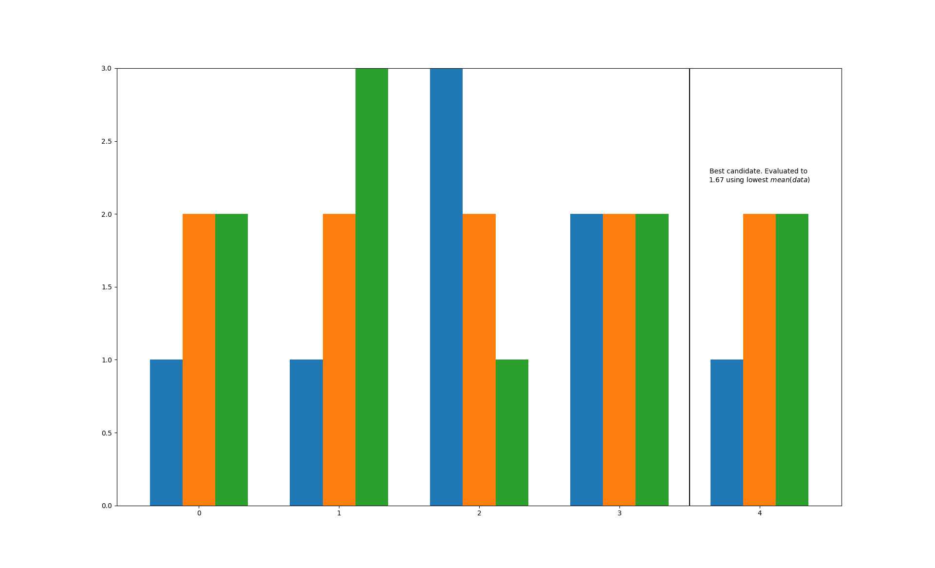
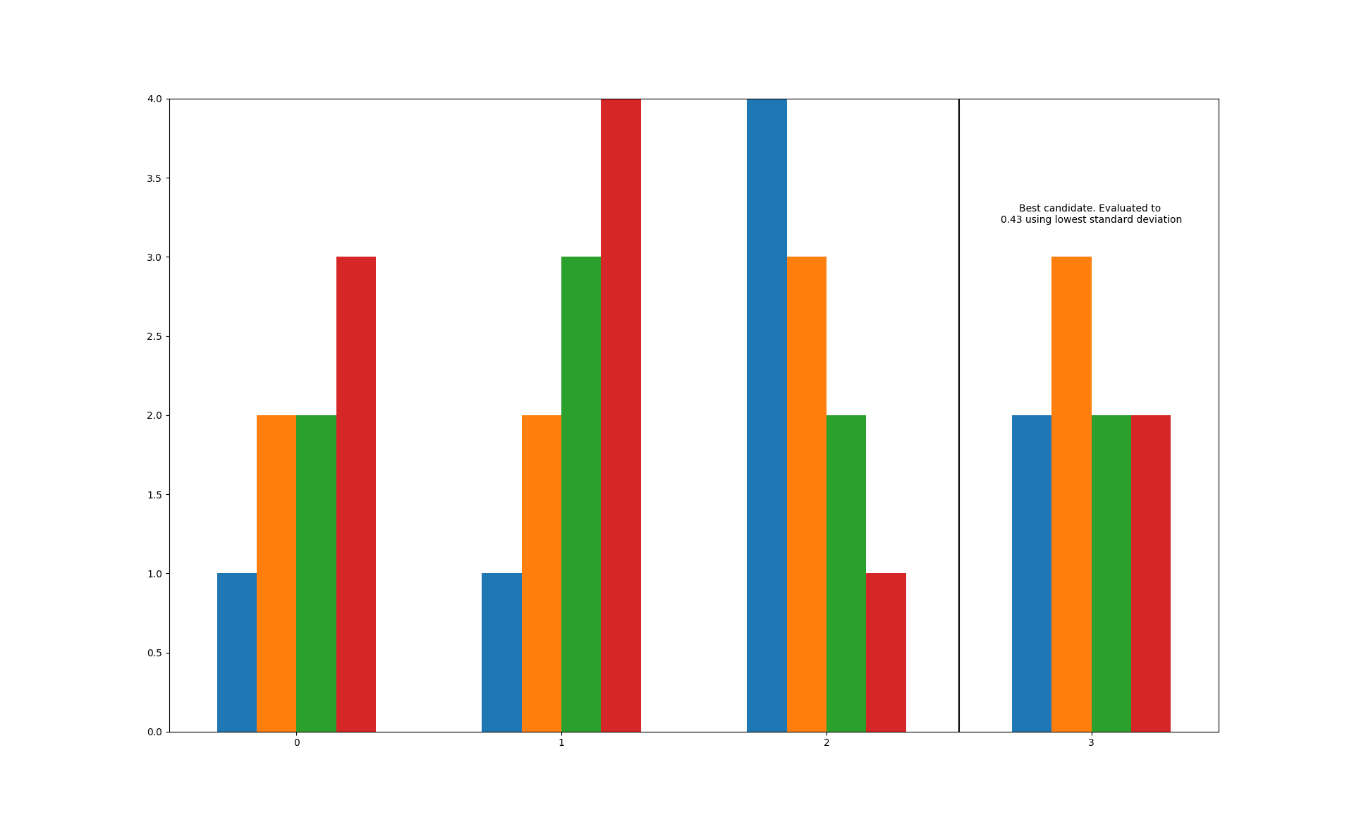
Modify the evaluation method, add a nicer description and get rid of the ugly duplicates:
>>> data=[(1, 2, 2, 3), (1, 2, 3, 4), (4, 3, 2, 1), (2, 3, 2, 2)]
>>> bars=best_bar(
...     data, method=np.std, duplicate=False,
...     descriptive='standard deviation')
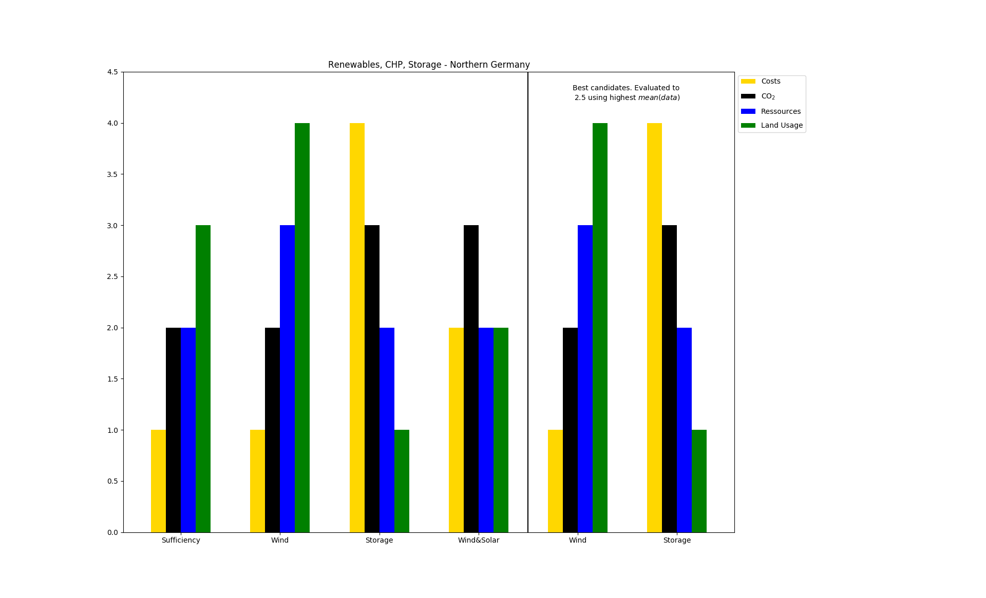
A simplified use case for an energy system analysis:
>>> bars=best_bar(
...     data,
...     method=np.mean,
...     lowest=False,
...     indicator_labels=['Costs', 'CO$_2$', 'Ressources', 'Land Usage'],
...     colors=['gold', 'black', 'blue', 'green'],
...     set_labels=['Sufficiency', 'Wind', 'Storage', 'Wind&Solar'],
...     title='Renewables, CHP, Storage - Northern Germany')
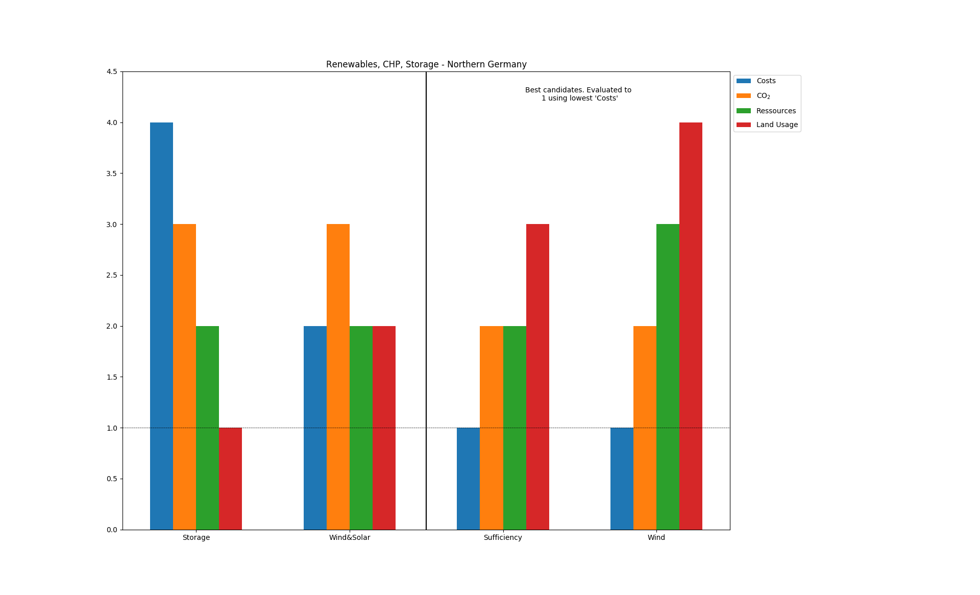
Everybody wants to use pandas.DataFrames because they are awesome. Make sure to transform the indices and columns to lists!
This Example use an indicator as evaluatoin method:
>>> df=pd.DataFrame(data,
... index=['Sufficiency', 'Wind', 'Storage', 'Wind&Solar'],
... columns=['Costs', 'CO$_2$', 'Ressources', 'Land Usage'])
>>> bars=best_bar(
...     data,
...     method='Costs',
...     lowest=True,
...     duplicate=False,
...     indicator_labels=df.columns.tolist(),
...     set_labels=df.index.tolist(),
...     title='Renewables, CHP, Storage - Northern Germany')
- tessif.visualize.compare.bar(data, indicator_labels=[], colors=[], set_labels=[], title=None, **kwargs)[source]
Simple bar plotting utility.
Used for visually comparing scalar data of the same type among sets (usually parameters to compare different scenarios or models).
Note
To automatically choose and visualize a best candidate among scenarios/models, consider using
best_bar().- Parameters:
data¶ (
Containeror apandas.DataFrame) –2 levels deep container of the data to be drawn. As in:
data = [(indicator1, ..., indicatorN), ...]
Or a
DataFrameas in:data = pandas.DataFrame( [(indicator1, ..., indicatorN), ...], colums=['indicator1', ..., 'indicatorN]) )
The number of indicators (the length of the nested container or the number of columns inside the data frame) equals the number of bars to drawn per set.
The number of sets is determined by the number of entries in the top level container or the number of rows inside the data frame.
indicator_labels¶ (sequence of str, default = []) –
Sequence of strings labeling the indicators of the
datasubsets.If not empty a legend entry will be drawn for each item.
Must be of equal length or longer than the nested sequences in
data.colors¶ (sequence of color strings, default = []) –
color specifications for the data sets in
data.If not empty each bar will be colored accordingly. Otherwise matplotlibs default color rotation will be used.
Must be of equal length or longer than the nested sequences in
dataset_labels¶ (
collections.abc.Sequence, default=[]) –labels for the data sets in
bar.data.If not empty an x-axis label will be drawn for each item.
Must be of equal length or longer than
bar.datatitle¶ (str, default=None) – Title to be shown above the plot. If
Noneno title will be drawn.kwargs¶ (dict) – kwargs are passed to
matplotlib.pyplot.bar().
- tessif.visualize.compare.bar3D(data, xy_data=None, labels=[], colors=[], xyz_labels=('x', 'y', 'z'), title=None)[source]
Visualize a variable dependend on two others as a field of (stacked) bars.
Designed for visualizing the
scalibility assessmentwhen comparing different energy system simulation models.TODOS:
1.) Implement all the parameters listed below 2.) Make the plot prettier 3.) Create the 2 example in the example section at the end of this docstring
- Parameters:
data¶ (
Containeror apandas.DataFrame) –2 levels deep container holding the of the data to be drawn. As in:
data = [[z(x1, y1), ... z(xN, y1,)],
        ...
        [z(xN, y1), ... z(xN, yN,)]]
Or a DataFrame as in:
data = pandas.DataFrame(
        data = [[z(x1, y1), ... z(xN, y1,)],
                ...
                [z(xN, y1), ... z(xN, yN,)]
               ],
        colums=x_values,
        index=y_values)
        )
Warning
If providing data NOT as a
pandas.DataFramexy_datahas to be provided.xy_data¶ (tuple, None, default=None) –
2 tuple containing the data for the x and y-axis repsectively.
First entry will be interpreted as x-axis data, second as y-axis data. All others will be ignored. An examplary tuples could be:
xy = ((1, 2, 3, 4, 5, 6), (2, 3, 4, 5, 1, 3, 10))
xy = (range(12), range(0, 24,2))
Warning
This parameter is only needed when
datais NOT supplied as apandas.DataFrame. It is ignored otherwise.labels¶ (
Sequence, default=[]) –Sequence of strings labeling the data sets in
bar3D.data.If not empty a legend entry will be drawn for each item.
Must be of equal length or longer than
datacolors¶ (
Sequence, default=[]) –Sequence of color specification string coloring the data sets in
data.If not empty each plot will be colord accordingly. Otherwise matplotlibs default color rotation will be used.
Number of colors stated must be greater equal the number of stacks to be plotted.
xyz_labels¶ (tuple, None, default=('x', 'y')) –
3 tuple of axis labeling strings.
First entry is interpreted as x label, second as y label, third as z label. All others will be ignored.
Use
Noneto not plot any axis labelstitle¶ (str, default=None) – Title to be shown above the plot. If
Noneno title will be drawn.
Examples
- tessif.visualize.compare.comp_plot(data_comp_df, title='')[source]
Draws hidden components / flows of all models in one figure. Designed to detect initial relationships between components.
- Parameters:
data_comp_df¶ (pandas.MultiIndex) –
MultiIndex¶ –
models (which _sphinx_paramlinks_tessif.visualize.compare.comp_plot.contains all time series of the pre selected components/flows of all) –
title¶ (str, default='') – Title to be shown above the plot. If ‘’ no title will be drawn.
- tessif.visualize.compare.pearson_self_comparison(pearson_df, titel_dic_key)[source]
correlation matrix plot a correlation matrix for each model to analyse interrelationships with in each model
- Parameters:
pearson_df¶ (pandas.DataFrame) –
themselves. (DataFrame _sphinx_paramlinks_tessif.visualize.compare.pearson_self_comparison.containing the results of the correlation of the models with) –
titel_dic_key¶ (str) – string containing the names of the models or their components / flows. these are used for the automatic labeling of the martixes