Visualization
Visualization tasks inside tessif are handled by the
visualize package. It provides plotting utilities
for displaying energy systems and their simulation results in the form
of graphs as well as common
plots for visualizing result data. Following sections provide detailed
information on how to use them as well as consequential links for more
detailed information.
Note
The current support of the various visualization capabilities can be
gauged and expanded using the tessif.visualize package.
Component Behaviour
When post processing / analyzing one or multiple optimized energy systems it is often helpful to visualize a components response to a certain characteristic. Visualizing component behavior can be useful from debugging, over verification up to inter model comparisons and statistical follow up investigation.
Following paragraphs provide some insights on how this can be used.
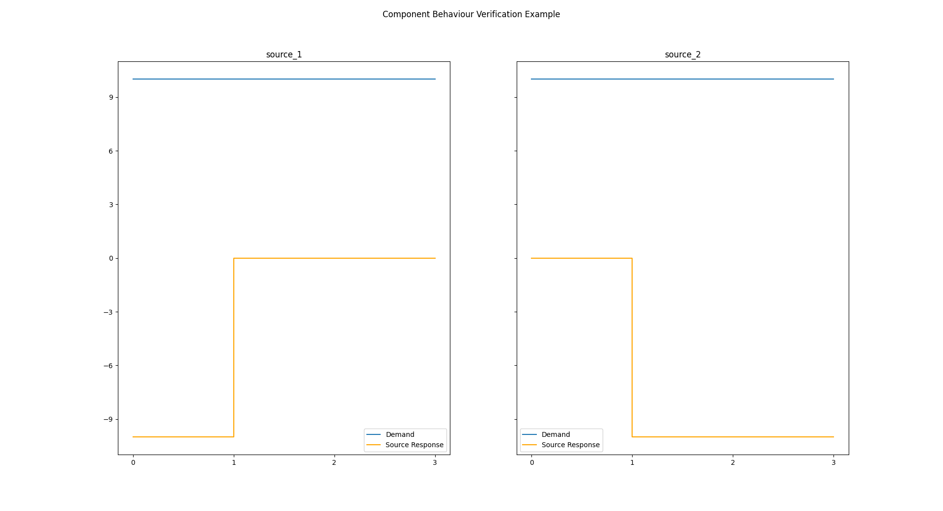
Verification
Reusing the
Specialized Verification Class's basic
example (jump to number 8 for the actual visualization):
(Optional) Change spellings logging level used by
spellings.get_fromtodebugfor decluttering output:>>> import tessif.frused.configurations as configurations >>> configurations.spellings_logging_level = 'debug'
Name the top level folder where your
tessif energy systemsresides in:>>> import os >>> from tessif.frused.paths import example_dir >>> folder = os.path.join( ... example_dir, 'application', 'verification_scenarios')
Construct the constraint dictionary according to your needs (make sure the lowest level is an iterable of strings to get expected results):
>>> chosen_constraints = {'linear': ('flow_rates_max.py', )}
Choose a parser depending on your energy system file formats (Using a .py file here holding the energs system data as dictionairy called
"mapping"):>>> import tessif.parse >>> chosen_parser = tessif.parse.python_mapping
Chose the components and the model you wish to verify:
>>> chosen_components = ('source', )
>>> chosen_model = 'oemof'
Initialize the Verificier:
>>> import tessif.verify
>>> verificier = tessif.verify.Verificier(
...     path=folder,
...     model=chosen_model,
...     components=chosen_components,
...     constraints=chosen_constraints,
...     parser=chosen_parser)
Show the network graph of the analyzed es:
>>> import matplotlib.pyplot as plt
>>> plt.close('all')     # to avoid warning when multiple doctests are run
>>> es_graph = verificier.plot_energy_system_graph(
...     component='source',
...     constraint_type='linear',
...     constraint_group='flow_rates_max',
...     node_color={'central_bus': '#9999ff',
...                 'source_1': '#ff7f0e',
...                 'source_2': '#2ca02c',
...                 'sink': '#1f77b4'},
...      node_size={'central_bus': 5000},)
>>> # es_graph.show()  # commented out for simpler doctesting

Show the numerical results:
>>> print(verificier.numerical_results[
...     'source']['linear']['flow_rates_max'])
centralbus           source1  source2  sink1
2022-01-01 00:00:00    -15.0    -35.0   50.0
2022-01-01 01:00:00    -15.0    -35.0   50.0
2022-01-01 02:00:00    -15.0    -35.0   50.0
2022-01-01 03:00:00    -15.0    -35.0   50.0
2022-01-01 04:00:00    -15.0    -35.0   50.0
2022-01-01 05:00:00    -15.0    -35.0   50.0
2022-01-01 06:00:00    -15.0    -35.0   50.0
2022-01-01 07:00:00    -15.0    -35.0   50.0
2022-01-01 08:00:00    -15.0    -35.0   50.0
2022-01-01 09:00:00    -15.0    -35.0   50.0
Use the
component visualization moduleto view the sources’ demand response:>>> # import the vis module and functools to tweak plotting: >>> from tessif.visualize import component_loads # nopep8 >>> import functools # nopep8
>>> # buffer the numerical results for easy access:
>>> results_df = verificier.numerical_results[
...     'source']['linear']['flow_rates_max']
>>> demand = results_df['sink1']
>>> sigs, responses = component_loads.response(
...     signals=[demand, demand],
...     responses=results_df[['source1', 'source2']],
...     # parameterize the demand plot looks:
...     sigplot=functools.partial(plt.plot, label='Demand'),
...     replot=functools.partial(
...         # parameterize the response plot looks
...         plt.step, c='orange', label='Source Response'),
...     legend=True,
...     shape=(1, 2),  # draw both subplots next to each other
...     title='Component Behaviour Verification Example',
...     titles=list(results_df[['source1', 'source2']].columns),
...     sharey='row'  # share the y axis among the both subplots
... )
>>> # parse the component response into a matplotlib figure:
>>> comp_response = plt.gcf()
>>> # comp_response.show()  # commented out for doctesting
Inter Model Comparison
When comparing multiple models for optimizing the same underlying energy system, comparing load results of the same component among simulations is a common endeavor. Following paragraph gives an example an how that can be accomplished.
Using tessif’s auto comparison feature results of the Hamburg Energy System (See hhes or csv data export for ways to generate the data used):
Stating the path, the data can be found:
>>> import os  # nopep8
>>> from tessif.frused.paths import write_dir  # nopep8
>>> omf_path = os.path.join( ... write_dir, 'tsf', 'hhes_results_omf.csv') >>> ppsa_path = os.path.join( ... write_dir, 'tsf', 'hhes_results_ppsa.csv')Reading in the data:
>>> import pandas as pd  # nopep8
>>> oemof_df = pd.read_csv(omf_path)
>>> pypsa_df = pd.read_csv(ppsa_path)
Show the column names
>>> oemof_df.columns
Index(['Unnamed: 0', 'biomass chp', 'chp1', 'chp2', 'chp3', 'chp4', 'chp5',
       'chp6', 'est', 'imported el', 'pp1', 'pp2', 'pp3', 'pp4', 'pv1', 'won1',
       'demand el', 'est.1', 'excess el', 'p2h'],
      dtype='object')
4. Plot the component responses using tessif’s
component visualization module:>>> # import the vis module and functools to tweak plotting: >>> from tessif.visualize import component_loads # nopep8 >>> import functools # nopep8 >>> import matplotlib.pyplot as plt # nopep8>>> # buffer the numerical results for easy access: >>> results = [-1*oemof_df['chp3'], -1*pypsa_df['chp3']] >>> demand = oemof_df['demand el']>>> sigs, responses = component_loads.response( ... signals=[demand, demand], ... responses=results, ... # parameterize the demand plot looks: ... sigplot=functools.partial(plt.plot, label='Demand'), ... replot=functools.partial( ... # parameterize the response plot looks ... plt.step, c='orange', label='CHP3 Response'), ... legend=True, ... shape=(2, 1), # draw both subplots next to each other ... title='CHP3 Component Behaviour', ... titles=list(['Oemof', 'PyPSA']), ... sharex='col' # share the y axis among the both subplots ... )>>> # parse the component response into a matplotlib figure: >>> comp_response = plt.gcf() >>> # comp_response.show() # commented out for doctesting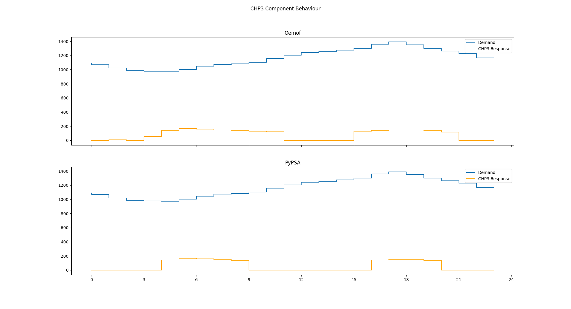
Energy Systems
Any kind of energy system analysis benefits from visualizing the system being analyzed. It is most likely the fastest way to communicate a basic system layout between human beings. The following sections proved details on how energy systems can be visualized in the context of tessif.
Tessif Energy System
When conducting energy system simulations using tessif, creating a
corresponding tessif energy system is
usually one of the first steps. To visualize such an energy system, the
energy system's class
method to_nxgrph() can
be used to conveniently transform the energy system into a
networkx.DiGraph object. Which then can be visualized using the
nxgrph module's function
draw_graph().
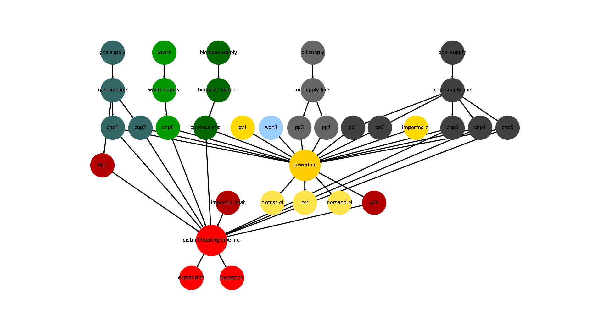
Following is a step by step example, of which many spin-offs can be found throughout this documentation. This method of visualization can be used both before and after optimization, since it only depends on the raw data the energy system is constructed out of.
1. Using tessif’s hardcoded example hub, to quickly create an energy system:
>>> import tessif.examples.data.tsf.py_hard as hardcoded_tsf_examples
>>> hhes = hardcoded_tsf_examples.create_hhes()
2. Using the
energy system's classmethodto_nxgrph()to create anetworkx.DiGraphobject:>>> graph = hhes.to_nxgrph()3. Utilizing the
nxgrph module'sfunctiondraw_graph()to create the visual output:>>> import matplotlib.pyplot as plt # nopep8 >>> import tessif.visualize.nxgrph as nxv # nopep8>>> drawing_data = nxv.draw_graph( ... graph, ... node_color={ ... 'coal supply': '#404040', ... 'coal supply line': '#404040', ... 'pp1': '#404040', ... 'pp2': '#404040', ... 'chp3': '#404040', ... 'chp4': '#404040', ... 'chp5': '#404040', ... 'hp1': '#b30000', ... 'imported heat': '#b30000', ... 'district heating pipeline': 'Red', ... 'demand th': 'Red', ... 'excess th': 'Red', ... 'p2h': '#b30000', ... 'biomass chp': '#006600', ... 'biomass supply': '#006600', ... 'biomass logistics': '#006600', ... 'won1': '#99ccff', ... 'gas supply': '#336666', ... 'gas pipeline': '#336666', ... 'chp1': '#336666', ... 'chp2': '#336666', ... 'waste': '#009900', ... 'waste supply': '#009900', ... 'chp6': '#009900', ... 'oil supply': '#666666', ... 'oil supply line': '#666666', ... 'pp3': '#666666', ... 'pp4': '#666666', ... 'pv1': '#ffd900', ... 'imported el': '#ffd900', ... 'demand el': '#ffe34d', ... 'excess el': '#ffe34d', ... 'est': '#ffe34d', ... 'powerline': '#ffcc00', ... }, ... node_size={ ... 'powerline': 5000, ... 'district heating pipeline': 5000 ... }, ... ) >>> # plt.show() # commented out for simpler doctesting
Software Specific Energy System
In some cases, it’s desirable to visualize a software specific energy system, as opposed to a Tessif Energy System. This is especially the case when Adding New Models. In particular when creating energy systems to debug and test the newly created interfaces.
To visualize a non-tessif system model using tessif however, a successful
optimization and a subsequent post
processing has to be performed. After that the nxgrph
module's function
draw_graph() can be utilized, using the
tessif.transform.nxgrph module.
Warning
For this method to be successful, the basic resultier of the post processing interface has to be implemented
Following paragraph illustrates an example (further examples can be found here):
1. Using tessif’s hardcoded oemof example hub, to quickly create an energy system:
>>> import tessif.examples.data.omf.py_hard as hardcoded_omf_examples # nopep8
>>> es = hardcoded_omf_examples.emission_objective()
2. Using the
oemof post processing module to post
process the oemof energy system:
>>> import tessif.transform.es2mapping.omf as post_process_oemof # nopep8
>>> resultier = post_process_oemof.OmfResultier(es)
3. Using the tessif.transform.nxgrph module’s class
tessif.transform.nxgrph.Graph to transform the oemof energy system
into a networkx.DiGraph object:
>>> import tessif.transform.nxgrph as nxt # nopep8
>>> graph = nxt.Graph(resultier)
4. Utilizing the nxgrph module's function
draw_graph() to create the visual output:
>>> import matplotlib.pyplot as plt  # nopep8
>>> import tessif.visualize.nxgrph as nxv  # nopep8
>>> drawing_data = nxv.draw_graph( ... graph, ... node_color={ ... 'CBE': '#006666', ... 'CBET': '#006666', ... 'Transformer': '#006666', ... 'Renewable': '#006600', ... 'Power Line': '#ffcc00', ... 'Demand': '#00ccff', ... }, ... ) >>> # plt.show() # commented out for simpler doctesting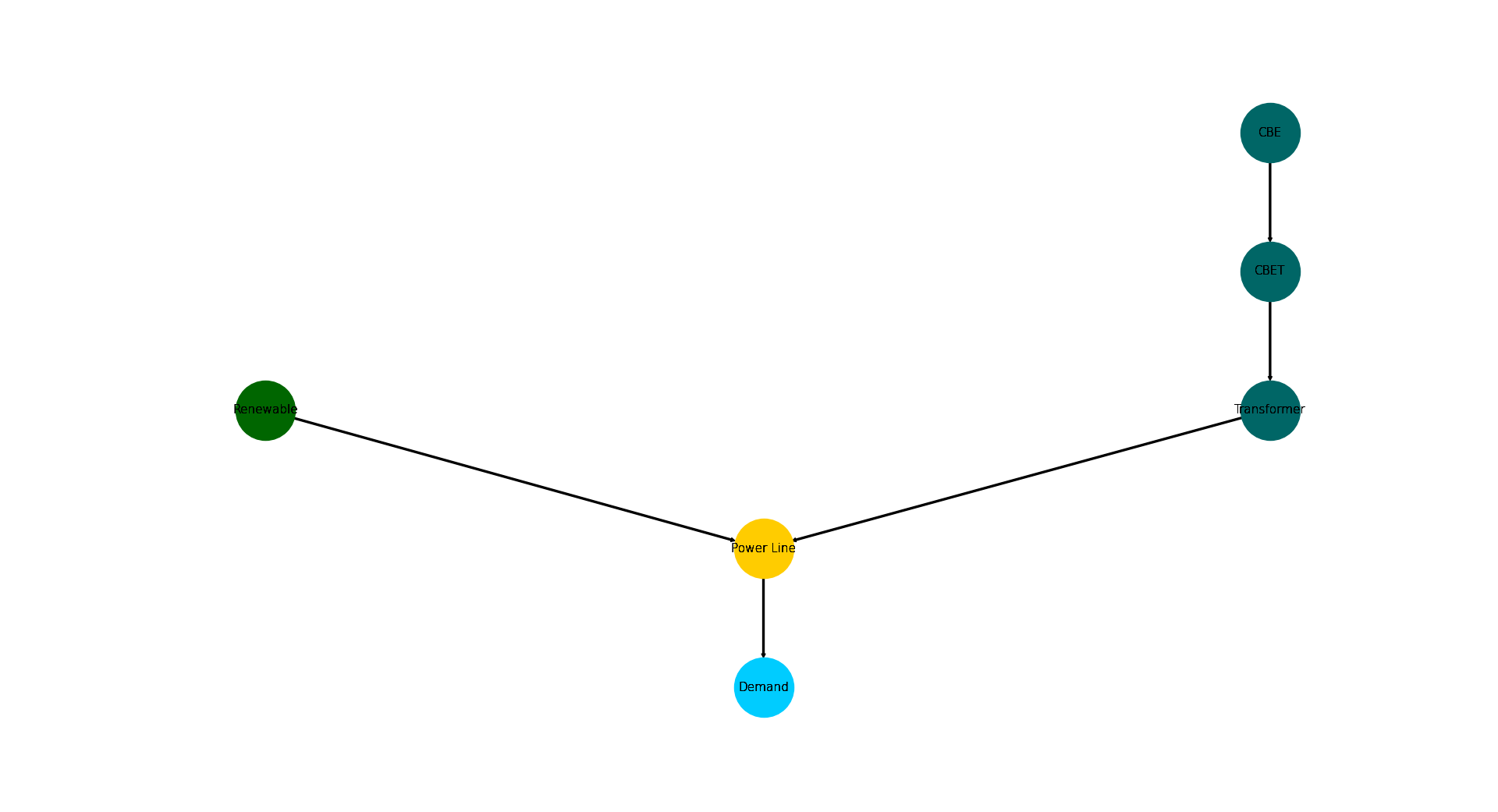
Average Time Integrated Results of All Components (Highly Questionable)
Visualizing and inspecting the average time integrated results (ATIR) can be very helpful in getting a first impression on an energy systems behaviour. They are easy to compute and allow quick inter-software and inter-system-scenario-combination comparisons. Average time integrated in this context is referred to as summing up the respective result for all time steps and dividing it by the number of timeseteps, i.e the statistical average. Following list gives an overview of the ATIRs tessif computes:
Installed Capacity
Capacity Factoror Characteristic Value
Specific Flow Costs
Specific Emissions
Net Energy Flow
Numerically Enhanced Energy System Graph
Visually Encoded Results
Graph chart visualizing:
installed capacity as node size
capacity factor as node fill size
flow costs as edge length
net energy flow as edge width
flow emissions as edge grayscaling
Load Results
When conducting an energy system analysis one of the most important kind of results are the actual load results the solver calculates. Be it a commitment problem or an expansion problem, inspecting solver created results is a common task to do.
Following sections provide details on how parts or the whole energy system can be visualized regarding the load results.
Load Distribution
Load distributions are of major interest when trying to obtain a general idea of an energy systems simulated behaviour. It can help direct further investigations or simply serve as an overview or even as final result. Using tessif, load distributions can be visualized in two ways:
Entire Energy System
Following paragraphs illustrate an example on how to plot an entire energy
system load distribution using
tessif’s hardcoded example hub’s
Hamburg Energy System.
Visualizing the distribution using the
loads module's function
bars():
1. Using tessif’s hardcoded example hub, to quickly create the energy system:
>>> import tessif.examples.data.tsf.py_hard as hardcoded_tsf_examples  # nopep8
>>> hhes = hardcoded_tsf_examples.create_hhes()
2. Using the
tessif.transform.es2es.omfmodule to transform the tessif energy system into an oemof energy system:>>> import tessif.transform.es2es.omf as tsf2omf # nopep8 >>> oemof_es = tsf2omf.transform(hhes)3. Using the
tessif.simulatemodule to optimize the energy system using oemof:>>> import tessif.simulate # nopep8 >>> optimized_hhes = tessif.simulate.omf_from_es(oemof_es)4. Using the
oemof post processing moduleto post process the optimized oemof energy system:>>> import tessif.transform.es2mapping.omf as post_process_oemof # nopep8 >>> load_resultier = post_process_oemof.LoadResultier(optimized_hhes)
Preprocessing the results for more convenience:
>>> power_source_names, power_source_loads = list(), list()
>>> heat_source_names, heat_source_loads = list(), list()
>>> coupled_source_names, coupled_source_loads = list(), list()
>>> for node, uid in load_resultier.uid_nodes.items(): ... if uid.component == 'source' or uid.component == 'transformer': ... outflows = load_resultier.node_outflows[node] ... outflows = outflows.loc[:, (outflows != 0).any(axis=0)] ... ... if not outflows.empty: ... if len(outflows.columns) == 1: ... loads_to_add = [list(outflows.iloc[:, 0])] ... names_to_add = [node] ... else: ... names_to_add, loads_to_add = list(), list() ... for col in outflows.columns: ... loads_to_add.append(list(outflows[col])) ... names_to_add.append(f"{node} ({col})") ... ... if uid.sector == 'power': ... power_source_names.extend(names_to_add) ... power_source_loads.extend(loads_to_add) ... ... elif uid.sector == 'heat': ... heat_source_names.extend(names_to_add) ... heat_source_loads.extend(loads_to_add) ... ... elif uid.sector == 'coupled': ... coupled_source_names.extend(names_to_add) ... coupled_source_loads.extend(loads_to_add)6. Visualizing the distribution using the
system loads module'sfunctionbars():>>> from tessif.visualize import system_loads # nopep8>>> axes = system_loads.bars( ... loads=[power_source_loads, heat_source_loads, coupled_source_loads], ... labels=[power_source_names, heat_source_names, coupled_source_names], ... category_labels=('Power', 'Heat', 'Coupled'), ... hatches=None)>>> # axes.figure.show() # commented out for doctesting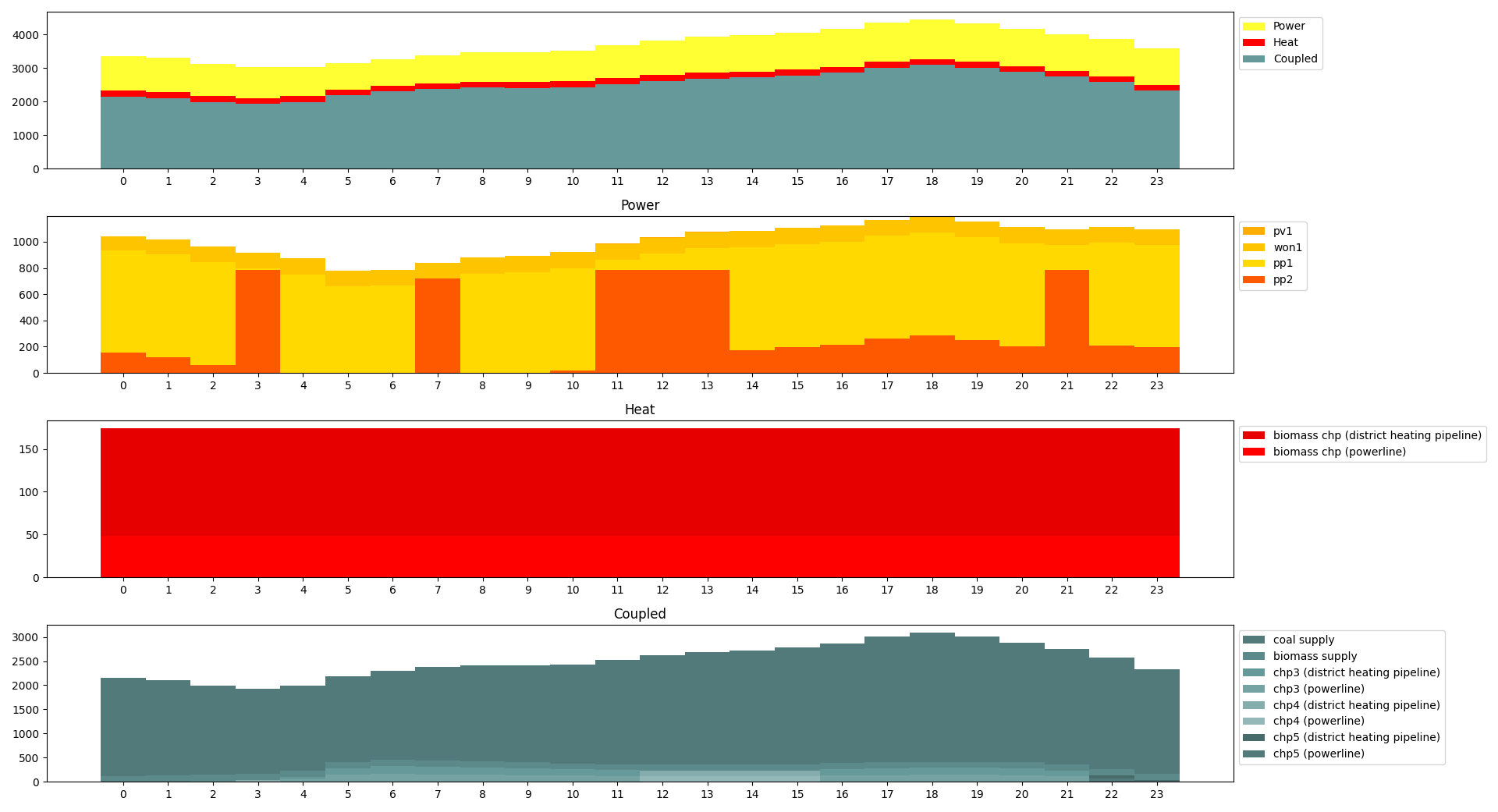
Alternatively the
system loads module'sconvenience wrapperbars_from_es()can be used:>>> from tessif.visualize import system_loads>>> axes = system_loads.bars_from_es( ... optimized_hhes, ... category_labels=('Power', 'Heat', 'Coupled'), ... hatches=None)>>> # axes.figure.show() # commented out for doctesting
Individual Energy System Components
Following paragraphs illustrate an example on how to plot singular component
load distributions using
tessif’s hardcoded example hub’s
Hamburg Energy System.
Visualizing the distribution using the
component loads module's function
bar_lines():
1. Utilize the
load_resultierfrom above:>>> pl_loads = load_resultier.node_load['powerline']
Drop all 0 column loads to increase readability:
>>> pl_loads = pl_loads.loc[:, (pl_loads != 0).any(axis=0)]2. Visualizing the bus loads using the
component loads module'sfunctionbar_lines():>>> from tessif.visualize import component_loads # nopep8>>> axes = component_loads.bar_lines( ... pl_loads, ... component_type='bus')>>> # axes.figure.show() # commented out for doctesting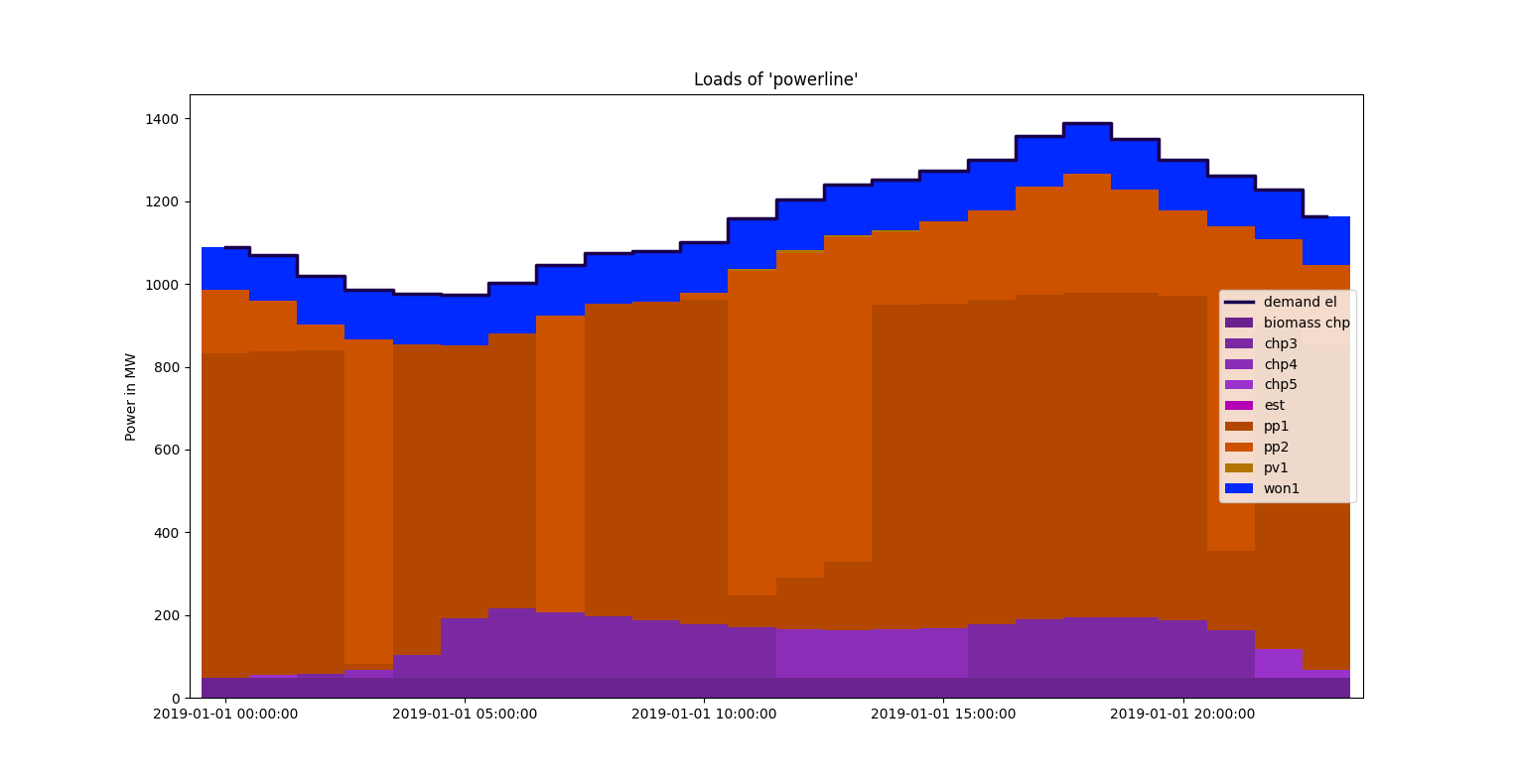
Load Duration Curves
Visualizing a component’s load as load duration curve gives valuable insight on the utilization of a component while still conveying more details like for example a simple capacity factor.
Following examples illustrate how the
ldc module's function
plot() can be used to quickly draw a load
duration curve:
1. Reusing the load results of the Entire Energy System example:
>>> pp1_loads = load_resultier.node_load['pp1']
>>> chp3_loads = load_resultier.node_load['chp3']
Preprocessing the data for more convenience:
>>> pp1_power_loads = list(pp1_loads['powerline'])
>>> chp3_power_loads = list(chp3_loads['powerline'])
>>> chp3_heat_loads = list(chp3_loads['district heating pipeline'])
Importing the visualization functionality:
>>> import tessif.visualize.ldc as visualize_ldc  # nopep8
>>> import matplotlib.pyplot as plt  # nopep8
Singular LDC
Plotting only a singular load duration curve:
>>> visualize_ldc.plot(
...     loads=[pp1_power_loads],
...     subcat_labels=['Power Plant 1'],
...     category_labels=['HH-ES Power'],
...     tight_layout=True,
... )
>>> ldc_fig = plt.gcf() >>> # ldc_fig.show() # commented out for doctesting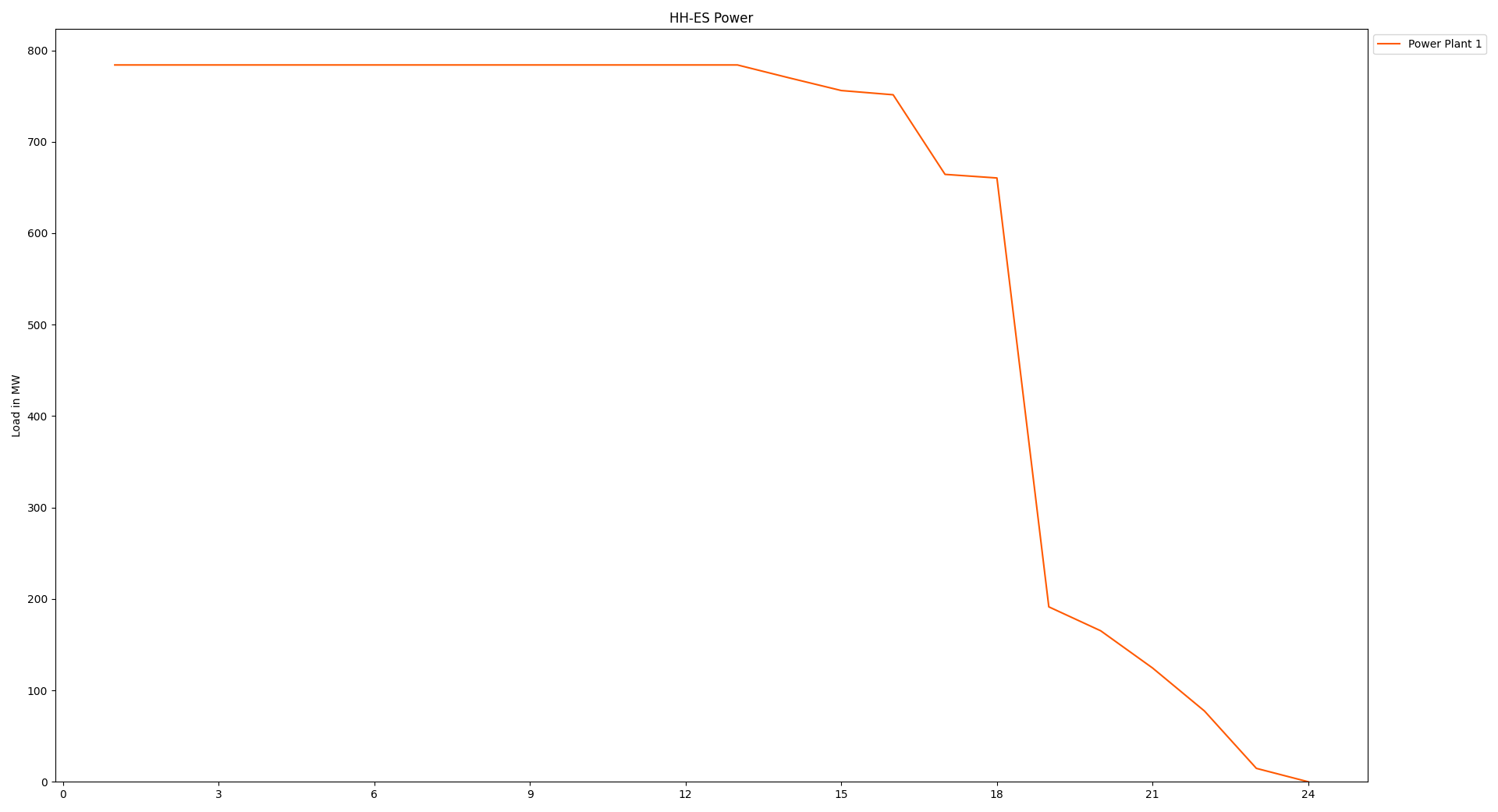
Multiple LDCs
Multiple load duration curves can be plotted into the same subplot:
>>> visualize_ldc.plot(
...     loads=[chp3_power_loads, chp3_heat_loads],
...     subcat_labels=['Power', 'Heat'],
...     category_labels=['HH-ES CHP3'],
...     tight_layout=True,
... )
>>> ldc_fig = plt.gcf() >>> # ldc_fig.show() # commented out for doctesting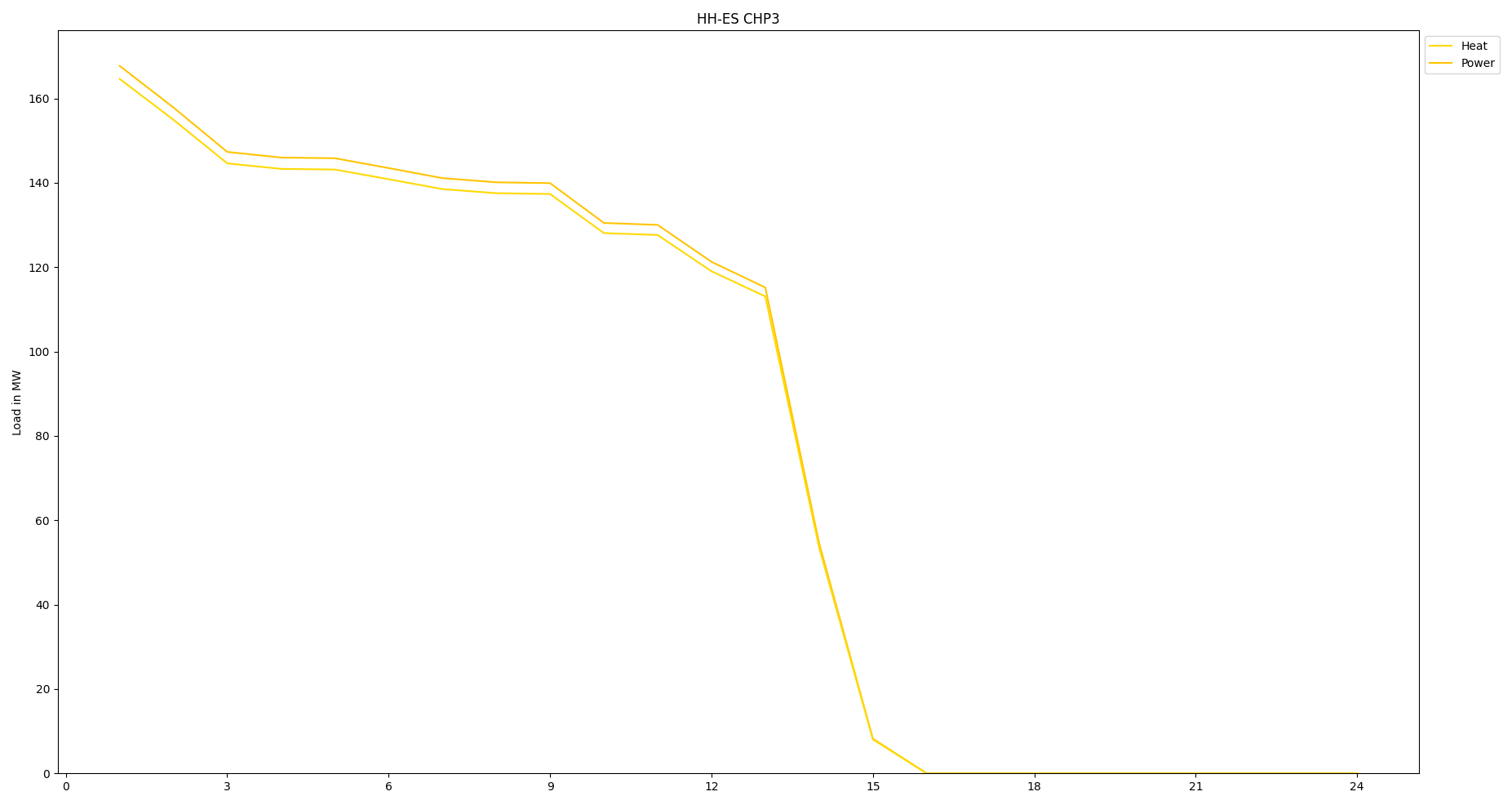
This however treats all loads as they were in the same category. Utilizing the
powerful list engine of the tessif.visualize.ldc module, the plots can
easily be comprehended as two categories:
subcat and category labels:
>>> visualize_ldc.plot(
...     # note how loads and subcats are passed as nested lists
...     loads=[[chp3_power_loads], [chp3_heat_loads]],
...     subcat_labels=[['Power'], ['Heat']],
...     # commented out for now
...     # category_labels=['HH-ES CHP3'],
...     tight_layout=True,
... )
>>> ldc_fig = plt.gcf() >>> # ldc_fig.show() # commented out for doctesting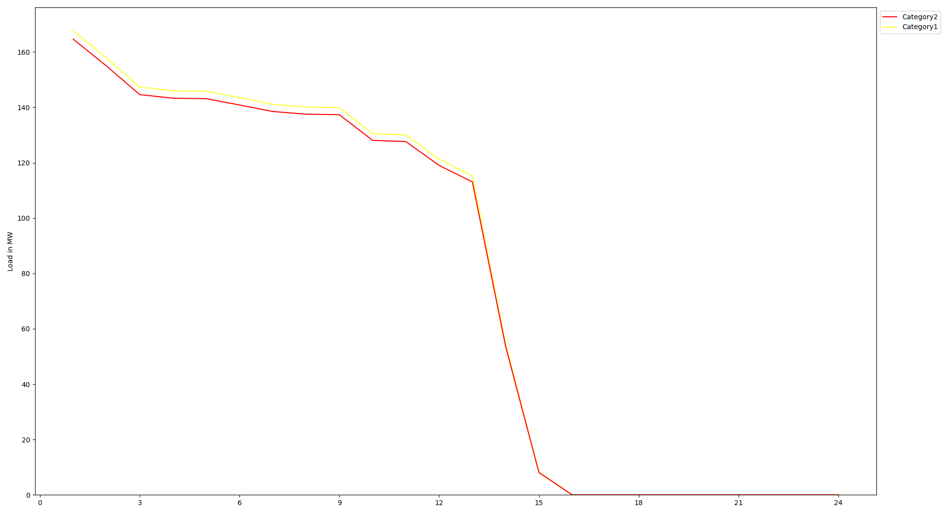
Entire Energy System
Expanding on the example above a fill energy system analysis using ldc plots can easily be created:
1. Reusing the preprocessed loads form the Entire Energy System example:
>>> visualize_ldc.plot(
...     loads=[power_source_loads, heat_source_loads, coupled_source_loads],
...     subcat_labels=[power_source_names, heat_source_names, coupled_source_names],
...     category_labels=('Power', 'Heat', 'Coupled'),
...     tight_layout=True)
>>> ldc_fig = plt.gcf() >>> # ldc_fig.show() # commented out for doctesting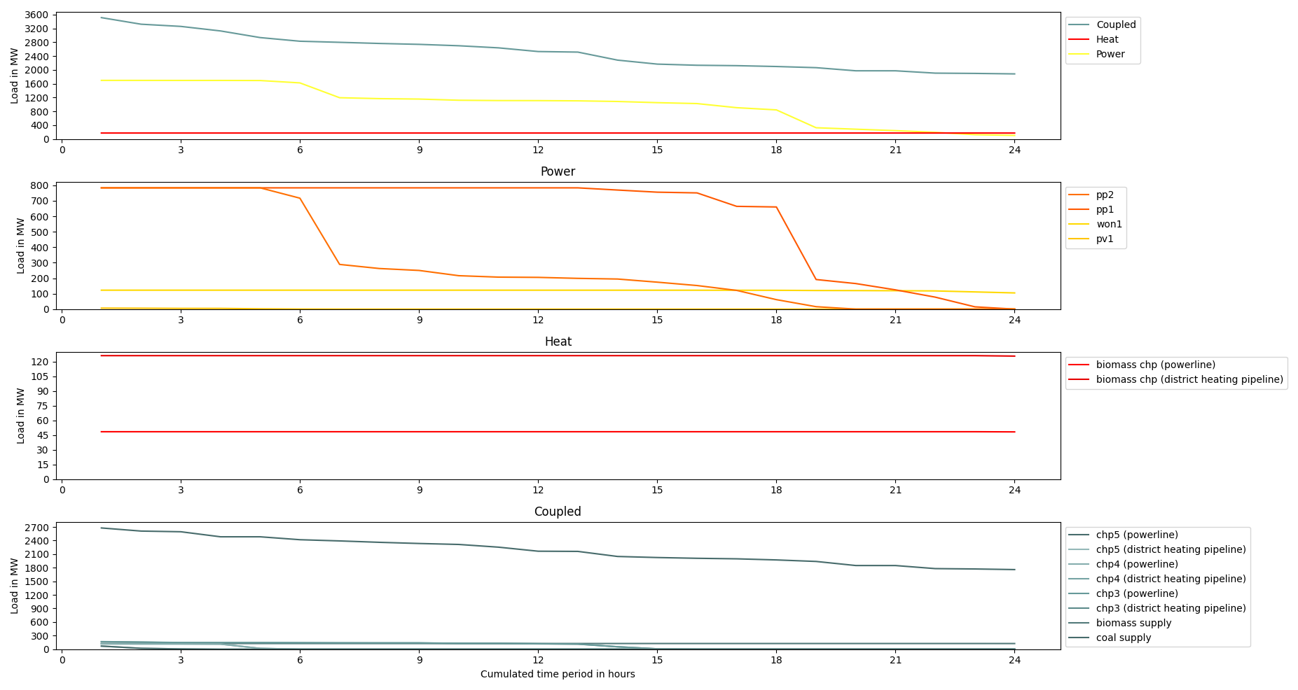
Scenario Comparison
When conducting energy system analysis, minimizing multiple values, is often part of the overarching goal. A common formulated goal could be: ‘Minimizing emissions, while keeping resource consumption and costs as low as possible’. Since optimizing for multiple values is currently not supported by any of tessif’s Supported Software Tools, the more common approach in energy system simulations is to formulate and constrain Secondary Objectives while optimizing. These secondary objectives are then varied among different scenarios to obtain a possible range of results. Hence the topic of scenario comparison.
Following sections give examples on visualizing simulation results of energy systems where one or multiple Secondary Objectives are part of the overall investigation.
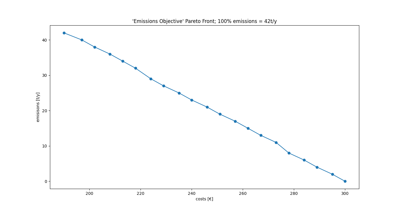
Pareto Front
A possible visualization option for comparing optimization results using multiple secondary objectives is the so called Pareto Front. In the context of energy supply system simulations the most common occurrence of such a pareto front would be the relation between the global costs and the global emissions of a given energy supply system. To lower the emissions, additional expenditures have to be made, or vice versa, to lower the overall costs, more pollutants have to be emitted.
Following sections give an example on how to use tessif’s xml interface to conveniently lower the allowed emissions stepwise from 100 to 0%. And how the corresponding computed costs can be visualized as pareto front:
Changing spellings logging level to declutter output:
>>> from tessif.frused import configurations
>>> configurations.spellings_logging_level = 'debug'
1. Create the path, the energy system’s xml representation is to be found at:
>>> # State the path, the xml file is located:
>>> from tessif.frused.paths import example_dir  # nopep8
>>> import os  # nopep8
>>> path = os.path.join(example_dir, 'data', 'tsf', 'xml', 'emissions.xml')
Read in and transform the energy system once to visualize it:
>>> from tessif import parse  # nopep8
>>> import tessif.transform.mapping2es.tsf as data2tsf  # nopep8
>>> tessif_es = data2tsf.transform(
...     parse.xml(
...         path,
...         global_constraints='e100'))
>>> import matplotlib.pyplot as plt # nopep8 >>> import tessif.visualize.nxgrph as nxv # nopep8 >>> graph = tessif_es.to_nxgrph() >>> drawing_data = nxv.draw_graph( ... graph, ... node_color={ ... 'Wind Power': '#00ccff', ... 'Gas Source': '#336666', ... 'Gas Grid': '#336666', ... 'Gas Plant': '#336666', ... 'Gas Station': '#666666', ... 'Pipeline': '#666666', ... 'Generator': '#666666', ... 'Powerline': 'yellow', ... 'Demand': 'yellow', ... }, ... ) >>> es_fig = plt.gcf() >>> # es_fig.show() # commented out for doctesting3. Transform and simulate the energy system varying lowering the allowed emissions by 5% for each simulation:
>>> # Handle the necessary imports:
>>> import tessif.transform.es2es.ppsa as tsf2pypsa  # nopep8
>>> import tessif.simulate as simulate  # nopep8
>>> import tessif.transform.es2mapping.ppsa as post_process_pypsa  # nopep8
>>> import collections  # nopep8
>>> scenario_results = collections.defaultdict(list) >>> for constraint in ['e' + str(i) for i in range(100, -5, -5)]: ... tessif_es = data2tsf.transform( ... parse.xml( ... path, ... global_constraints=constraint)) ... # Transform the es: ... pypsa_es = tsf2pypsa.transform(tessif_es) ... # ... # Simulate the es: ... optimized_pypsa_es = simulate.ppsa_from_es(pypsa_es) ... # ... # Post process the es: ... resultier = post_process_pypsa.IntegratedGlobalResultier( ... optimized_pypsa_es) ... ... # store the cost results and emission: ... scenario_results['costs'].append(resultier.global_results['costs (sim)']) ... scenario_results['emissions'].append(resultier.global_results['emissions (sim)'])3. Use the
visualize.comparemodule’s functionpareto2D()to draw the Pareto Front:>>> from tessif.visualize import compare # nopep8 >>> pf = compare.pareto2D( ... data=[ ... scenario_results['costs'], ... scenario_results['emissions'] ... ], ... title="'Emissions Objective' Pareto Front; 100% emissions = 42t/y", ... xy_labels=('costs [€]', 'emissions [t/y]'), ... marker='o', ... )>>> pareto_fig = plt.gcf() >>> # pareto_fig.show() # commented out for doctesting